Santa Creu i Sant Pau Recinte Modernista

Hospital Santa Creu i Sant Pau - Administration Building

Hospital Santa Creu i Sant Pau – Administration Building

More on Catalunya/Catalonia

Santa Creu i Sant Pau Recinte Modernista

The largest, and in many ways the most impressive, of the Modernist sites in Barcelona, indeed in all of Catalonia, is probably also one of the least known and visited. This is the Hospital de la Santa Creu i Sant Pau, designed by the architect Lluís Domènech i Montaner who was also responsible for the Palau de la Música Orfeó Català.

Although it’s always been possible to get an idea of the place (I first had the chance to walk around in the late 1990s) it was still used as a working hospital up to 2009 so access was limited to what you’d find in any hospital in the UK. Following its closure as a medical facility it has undergone a clean up and restoration and all I can say is that they have done a magnificent job – it looks as if it had just been completed rather than having the first stone laid on January 15th 1902.

The history of the hospital itself goes back a long way. The first Santa Creu (Holy Cross) was established in the Raval area of Barcelona with the foundation stone being laid on February 13th 1401. This became a large Gothic structure designed along the lines of an ecclesiastical cloister. However, after 500 years it was showing its age and not really up to the demands of ‘modern’ medicine and was also taking up space in the centre of an expanding industrial city. (The Raval area includes what is presently known as the ‘Barrio Chino’, for some a no-go area on the southern side of La Rambla, more or less the area behind the Liceo Opera House.)

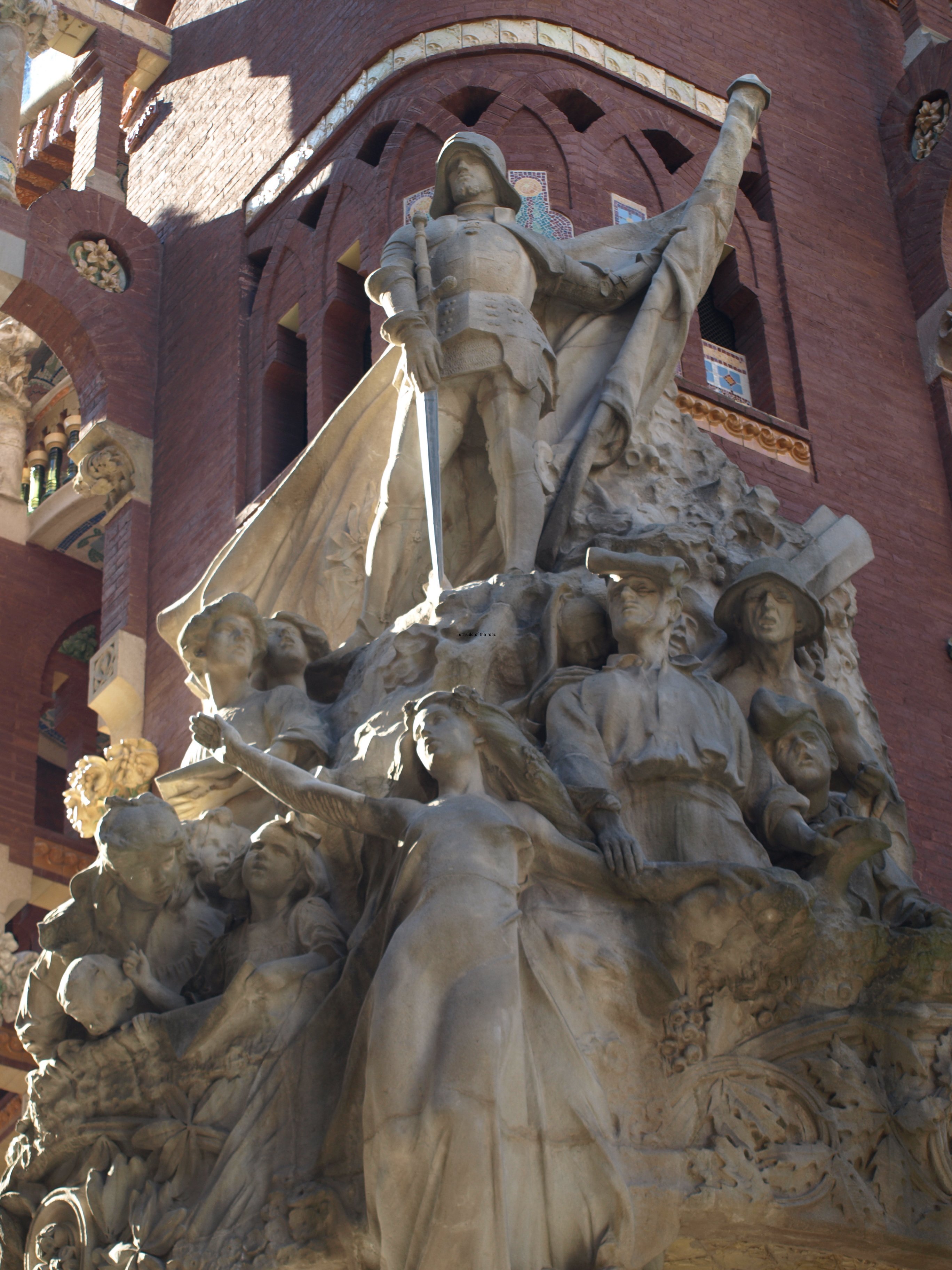
The money to kick-start the development came from a bequest in the will of a Catalan banker, Pau Gil i Serra, who made his ill-gotten gains in Paris – it’s his statue that stands above the fountain on the steps up to the main entrance, with Charity looking after the sick and poor in front of him and huge frogs on either side (I don’t know what they signify). He stipulated that the hospital should take up the challenge of the rapidly increasing advances in medical science and also that it should be dedicated to Sant Pau (Saint Paul), so his name was added to the original Santa Creu.

Hospital Santa Creu i Sant Pau - Pau Gil i Serra

Hospital Santa Creu i Sant Pau – Pau Gil i Serra

There was a competition but none of the three submissions were considered adequate so the commission was given to Domènech i Montaner (obviously no hint of nepotism or cronyism there!).

By all accounts he did his research and studied what was happening in hospital architecture throughout Europe and came up with the arrangement which had separate pavilions, devoted to different aspects of medicine, and then connected them all together with an extensive underground passageway system, providing access without having to go outside. That idea has gone out of fashion now and most modern hospitals are huge all-encompassing buildings, few of them seeming to have been designed with a scintilla of imagination.

The complex seems vast now but it’s only just over half of what was in the original plan as Domènech i Montaner planned 48 buildings, only 27 were actually constructed. He died, in 1923, before even that number was completed and the work was continued by his son to make the hospital ready for its official opening in January 1930.

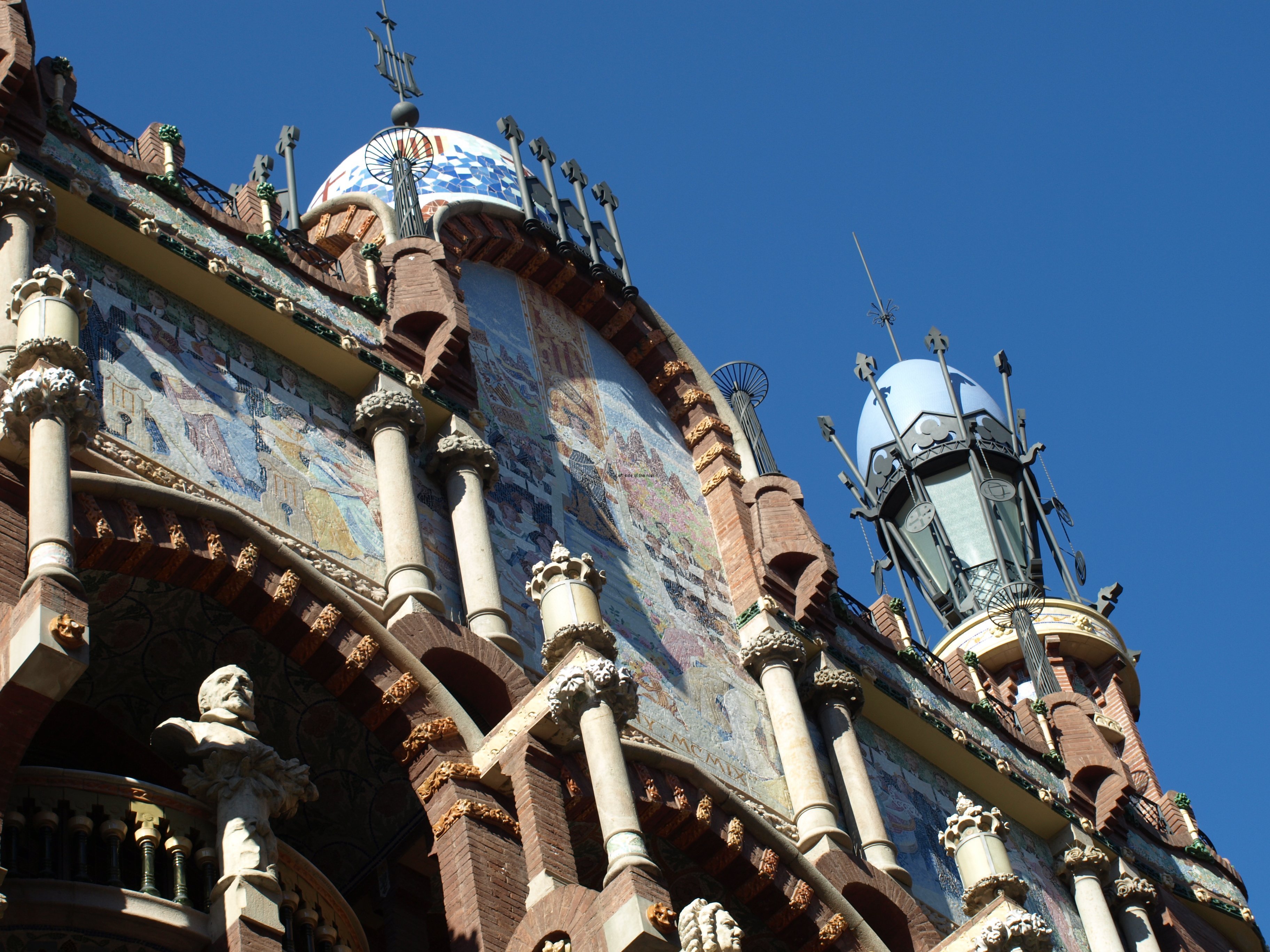
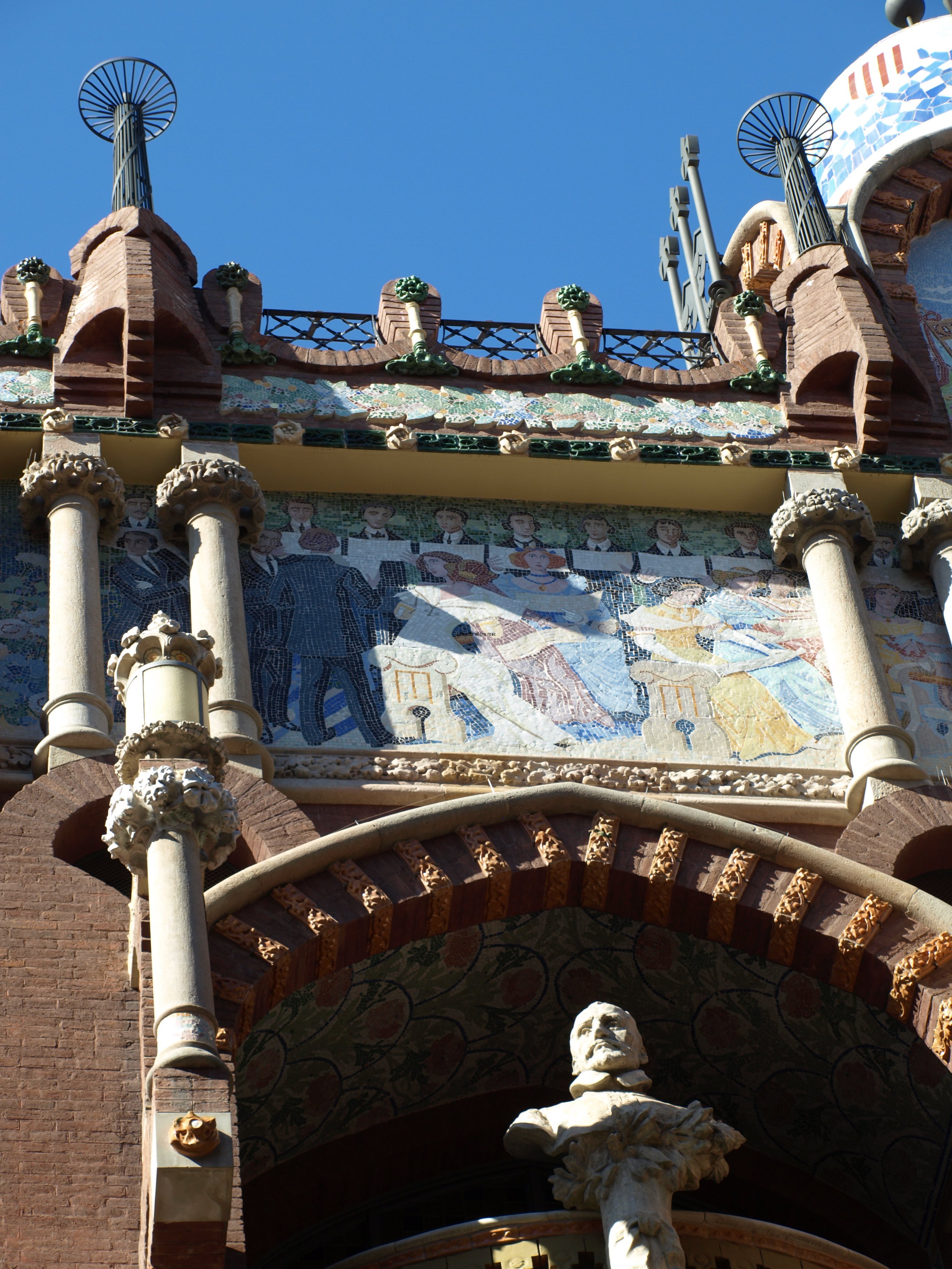
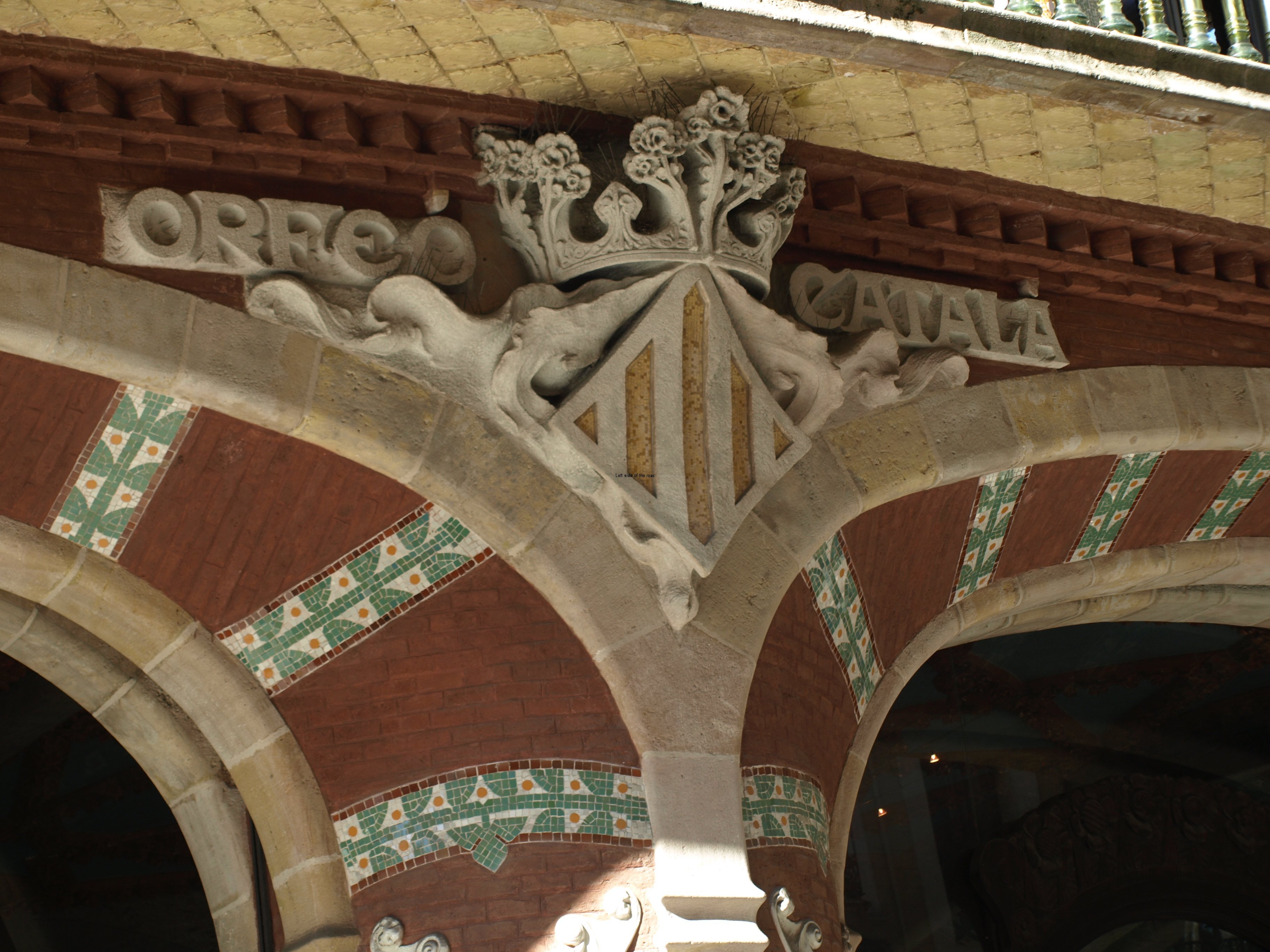
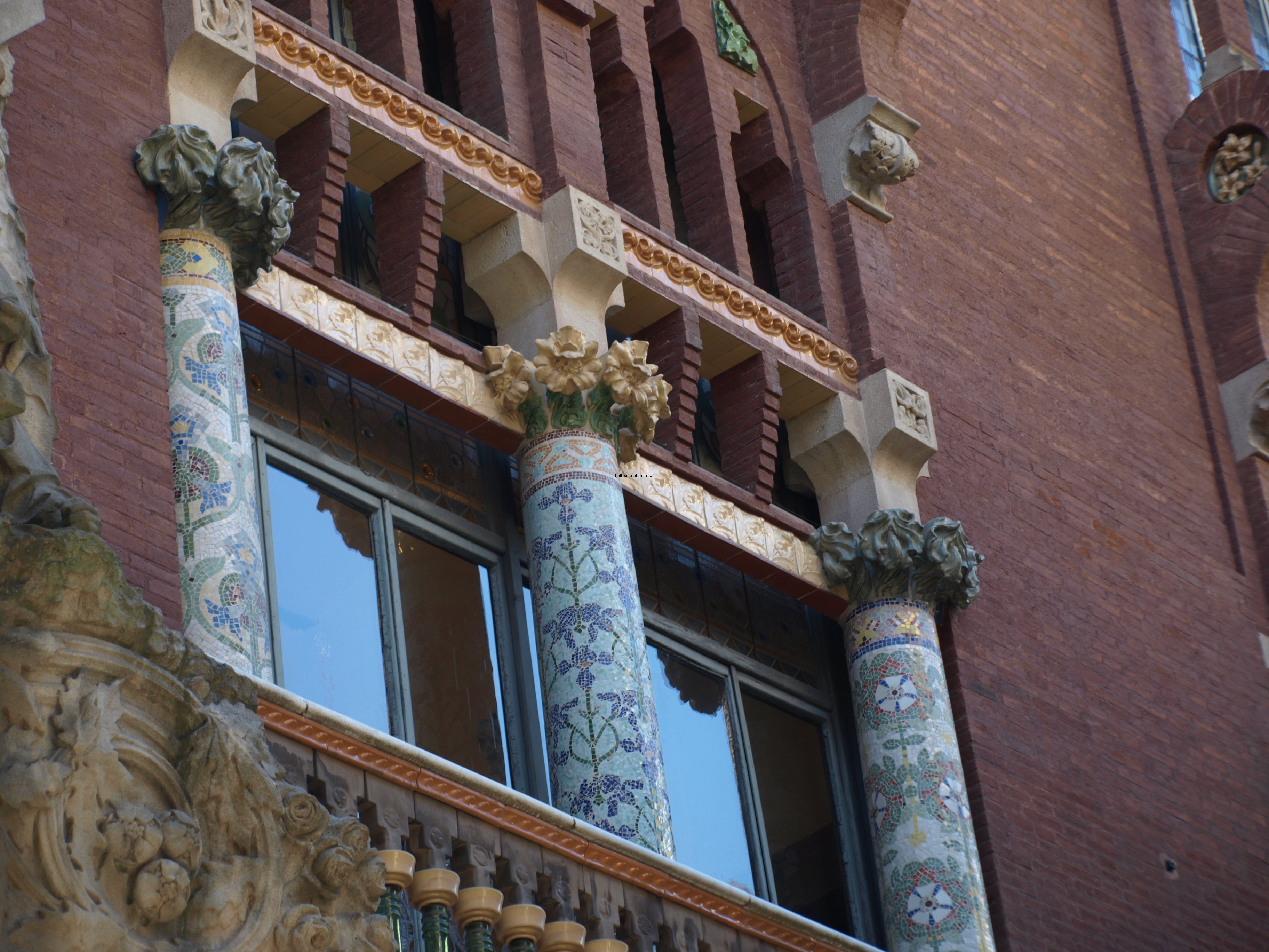
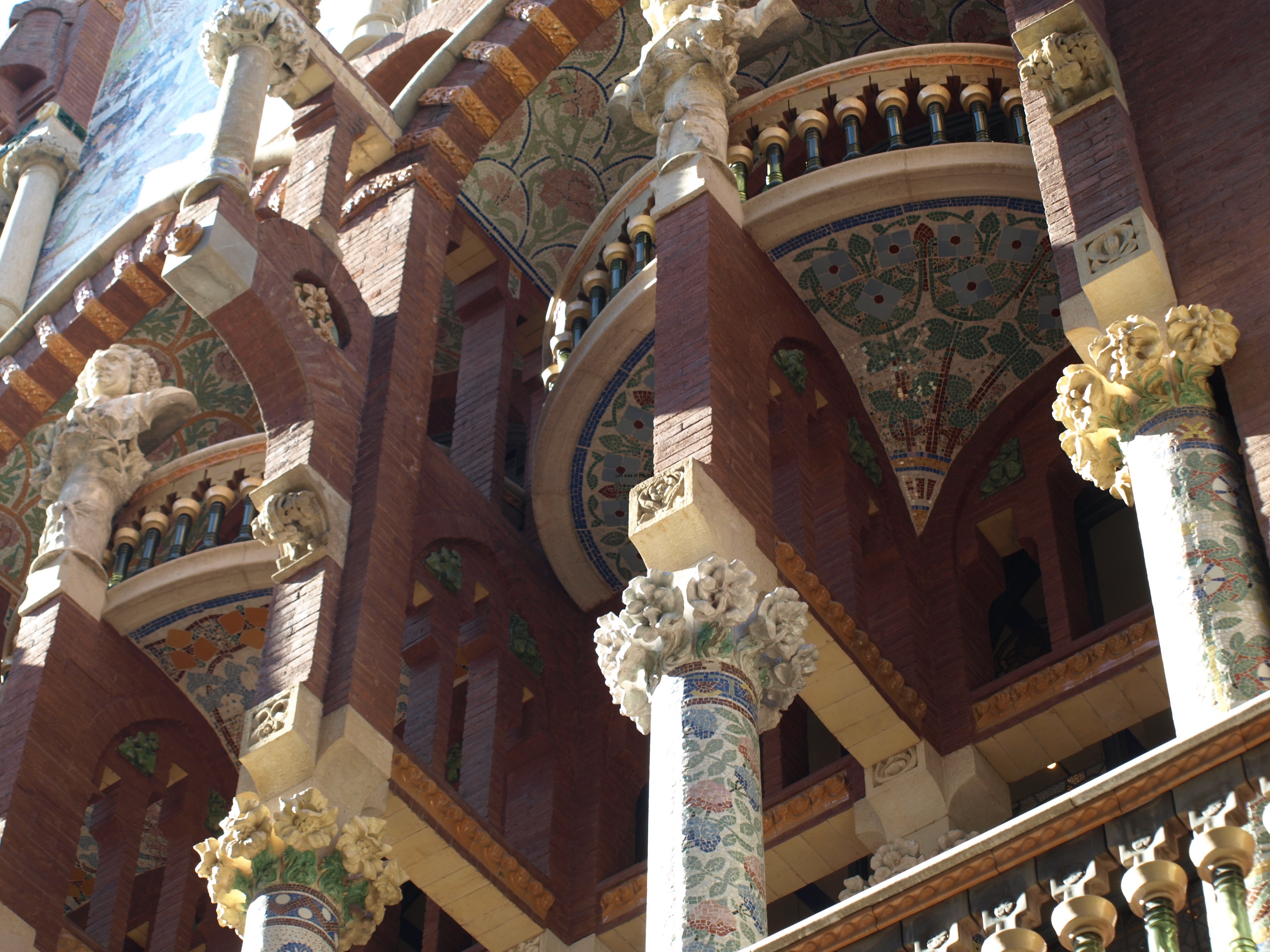
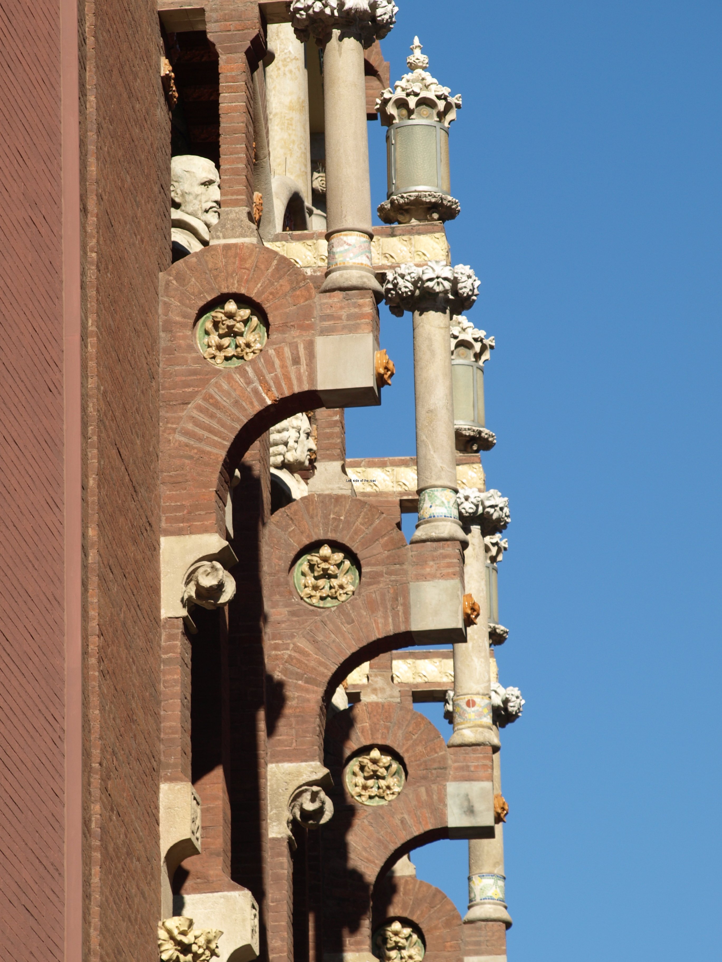
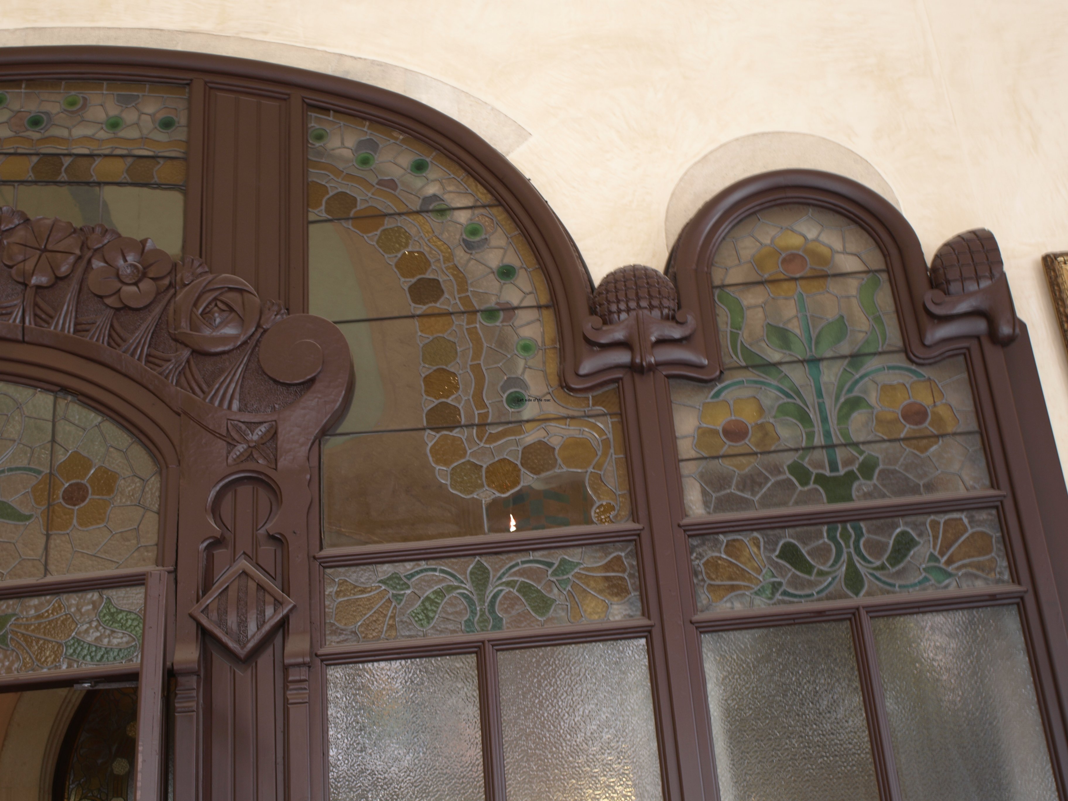
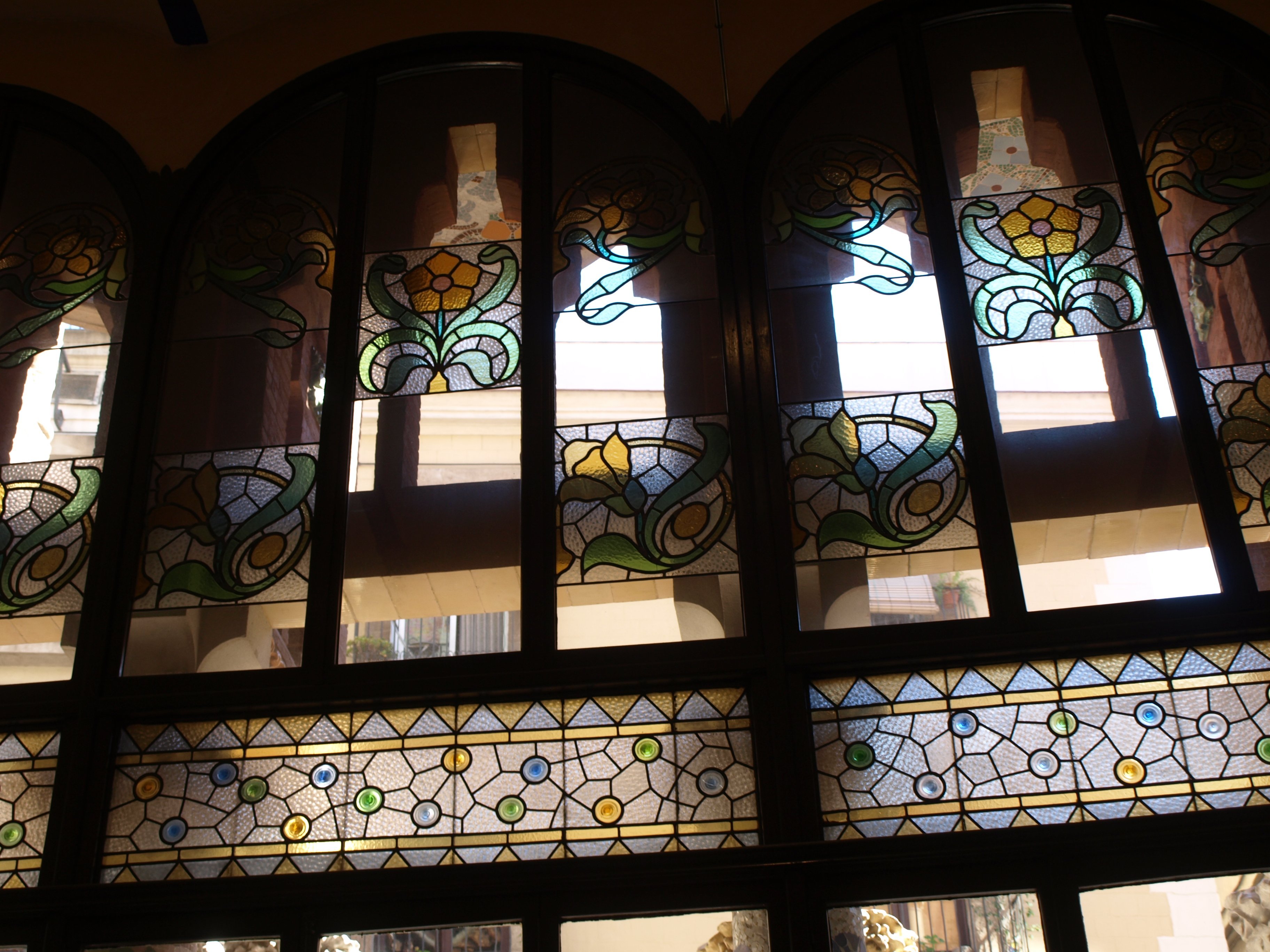
The jewel is definitely the main building on the corner of Carrer de Cartegena and Carrer de Sant Antoní Maria Claret. The building embraces the corner of the two streets and the approach is up the wide steps in the centre (with the statue and fountain). If you scan the façade of the building you start to notice those signature elements of Catalan Modernism: nature, the female form and Catalan nationalism as well as the use of the locally produced (then) building materials of brick, tiles, glass and wrought iron.

Hospital Santa Creu i Sant Pau - Entrance Hall

Hospital Santa Creu i Sant Pau – Entrance Hall

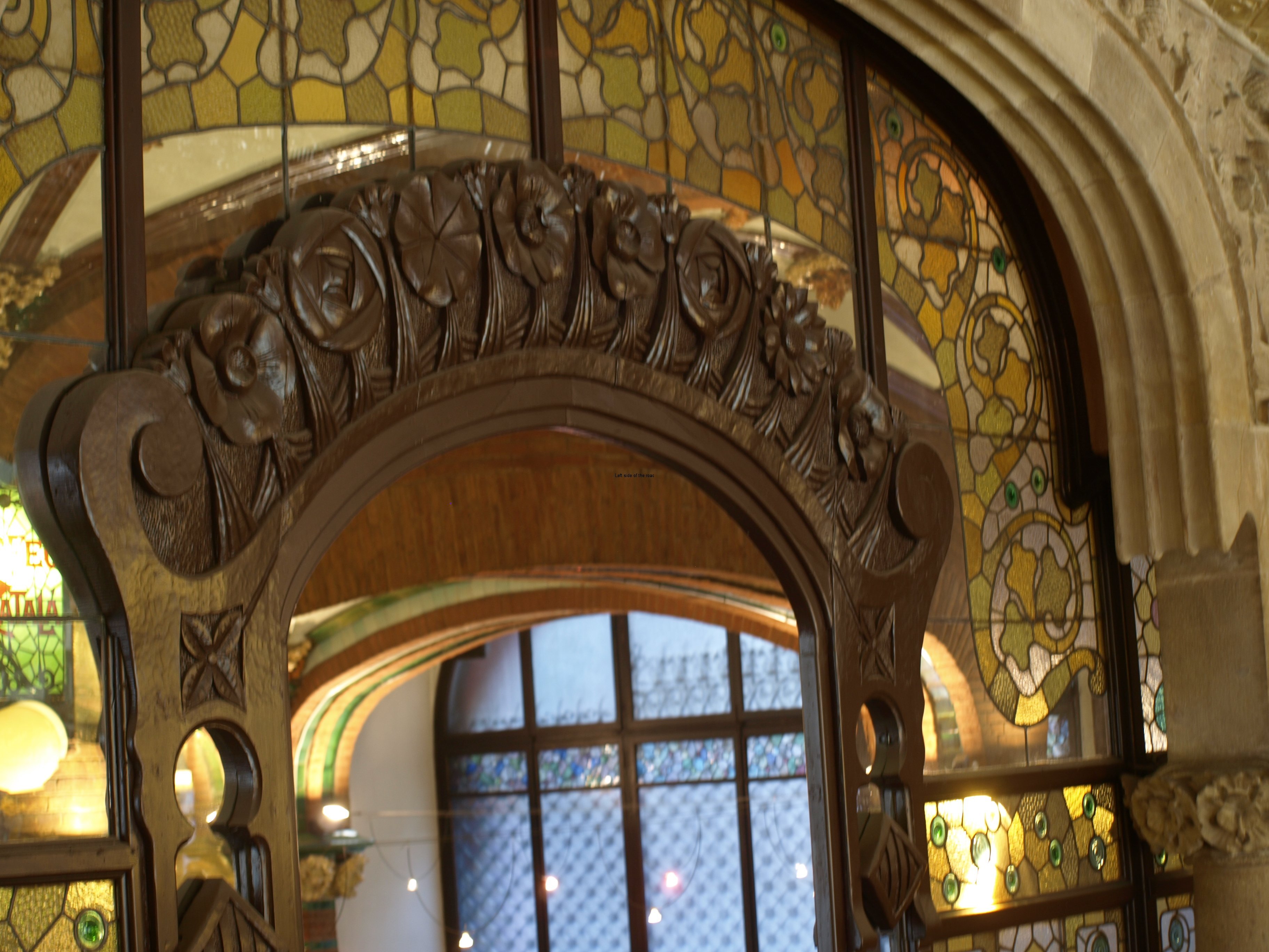
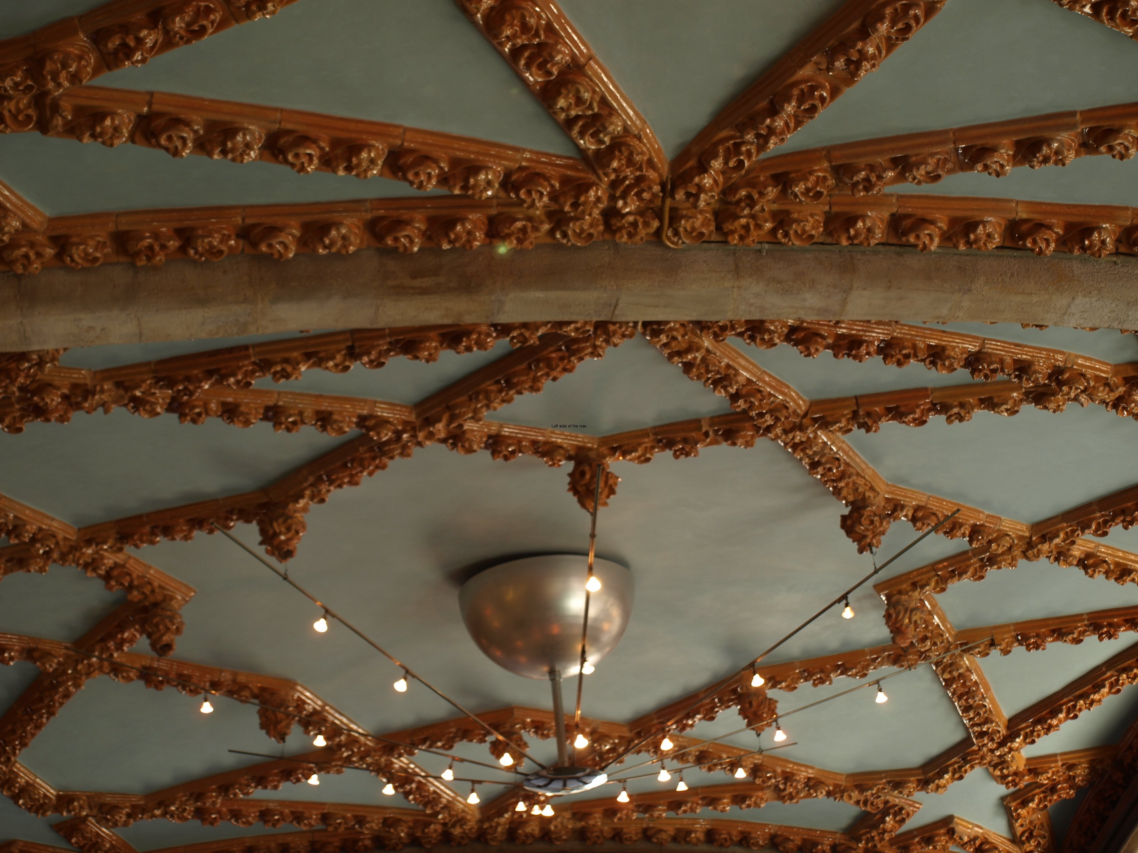
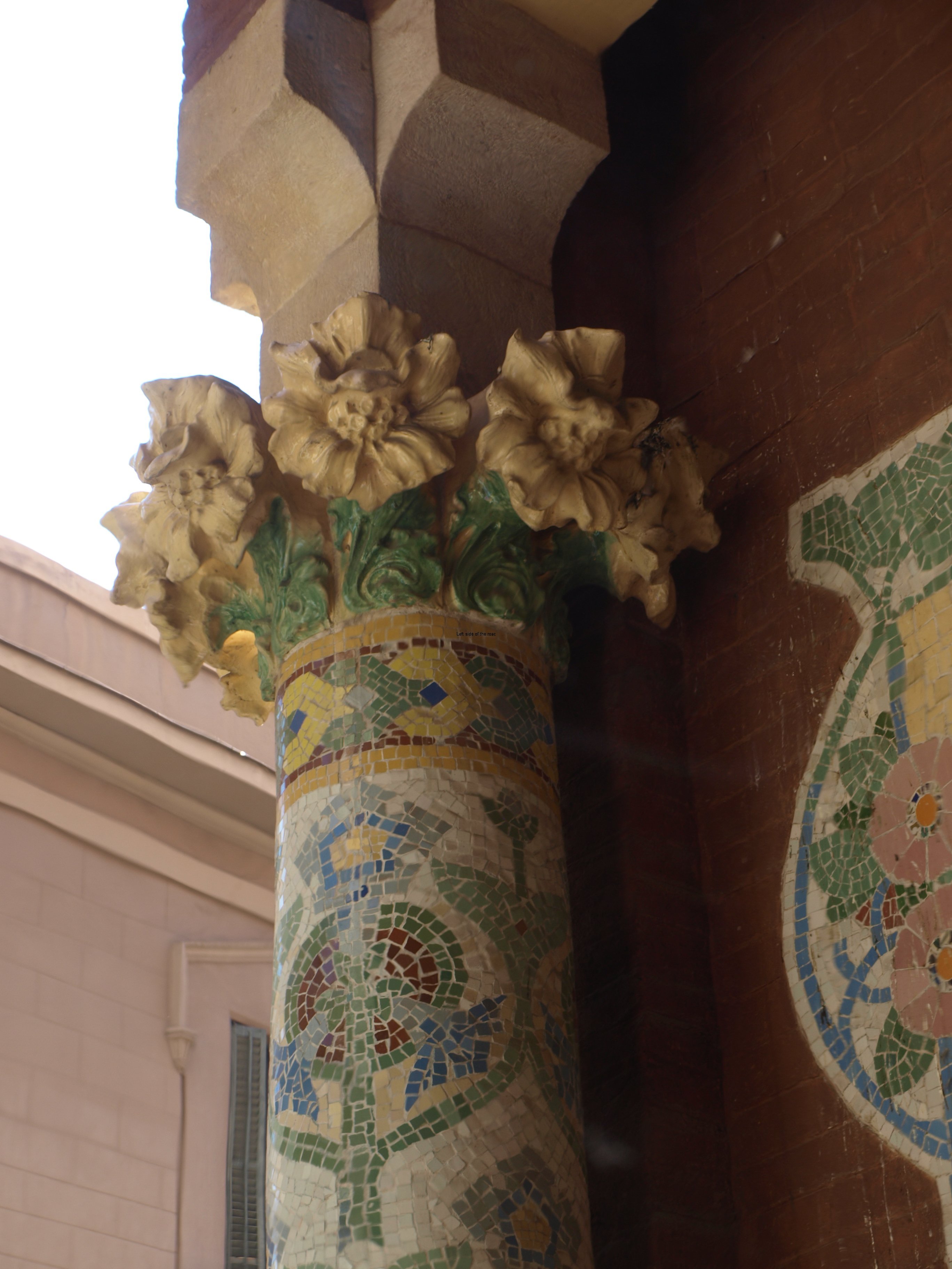
Once inside you’re greeted by intricate and colourful tile work which continues as you walk along the passageways and into the rooms off them. When there’s a natural break, a doorway or a corner, there’s a different style and/or colour. I’ve still not really understood why this all works. In other buildings (most notably the Palacio Real in Madrid or the Baroque Basilica de San Juan de Dios in Granada) when I’ve been faced with such extremes of ornamentation I’ve felt physically sick and have to leave to get some fresh air (or a beer) but that isn’t my reaction to Modernism. Something ‘softens’ the attack of colour and design and the overall effect becomes less of an assault on the senses.

The plan is to use the Administration Pavilion as an event/conference venue and that has meant that some of the spaces have been adapted for a future use but as far as I could see this had all been done whilst at the same time maintaining the integrity of the original designs.

A couple of spaces are worthy of special mention. The first is what would have been the chapel which is now called the Montaner Hall. You really have to look for Christ as he’s on a cross on the back wall of a first floor balcony. There’s no obvious altar now so I assume that it would have been a table structure on the ground floor underneath that crucifix. There’s the words of a short prayer (in Catalan) forming the balustrade of the balcony on three sides of the hall; an image in relief of Sant Jorge (Saint George) slaying the dragon above one of the doors; and a large mosaic which is more geometric with stylized plants and flowers rather than anything religious – this mosaic is underneath the crucifix.

Hospital Santa Creu i Sant Pau - Chapel

Hospital Santa Creu i Sant Pau – Chapel

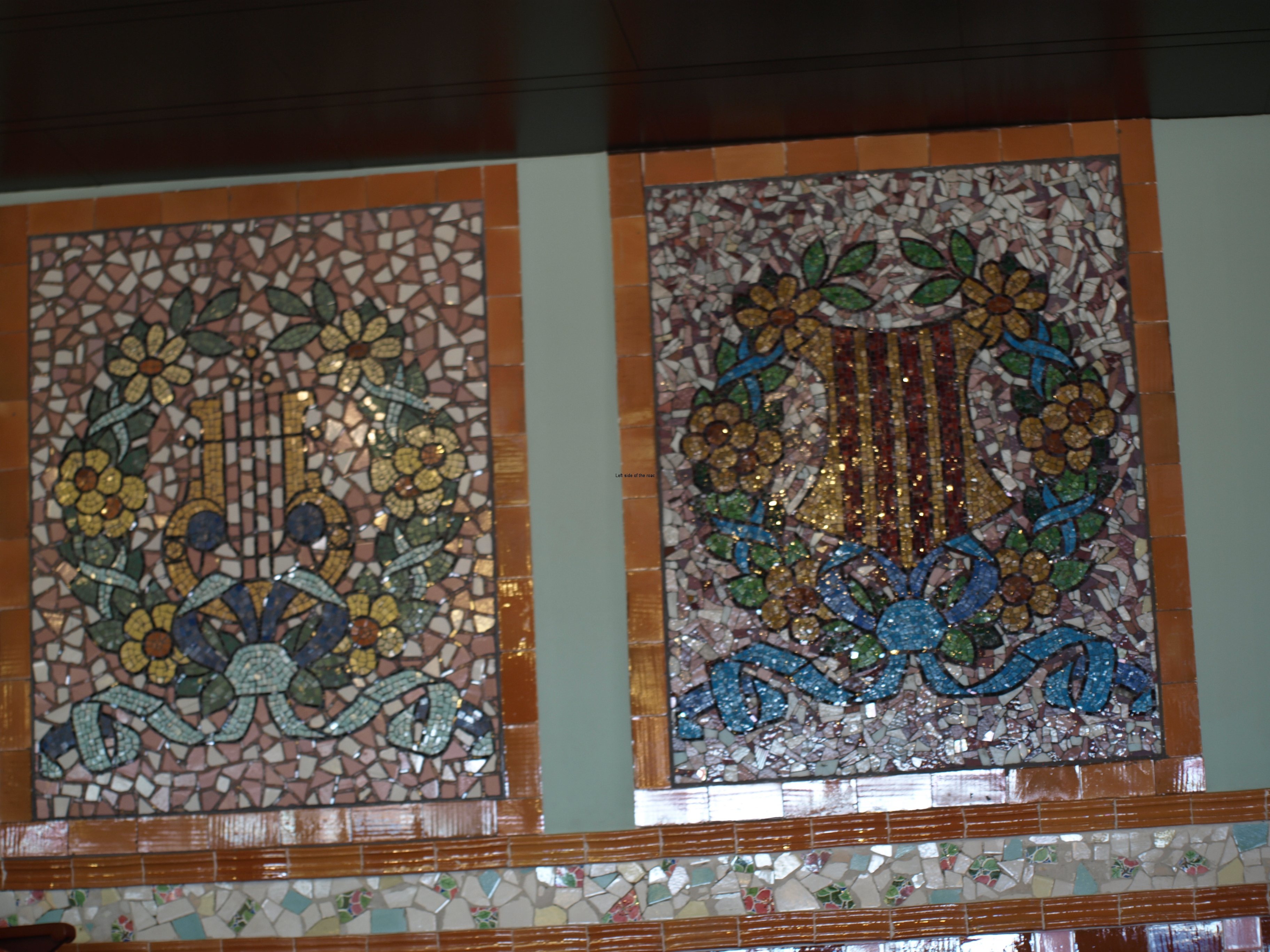
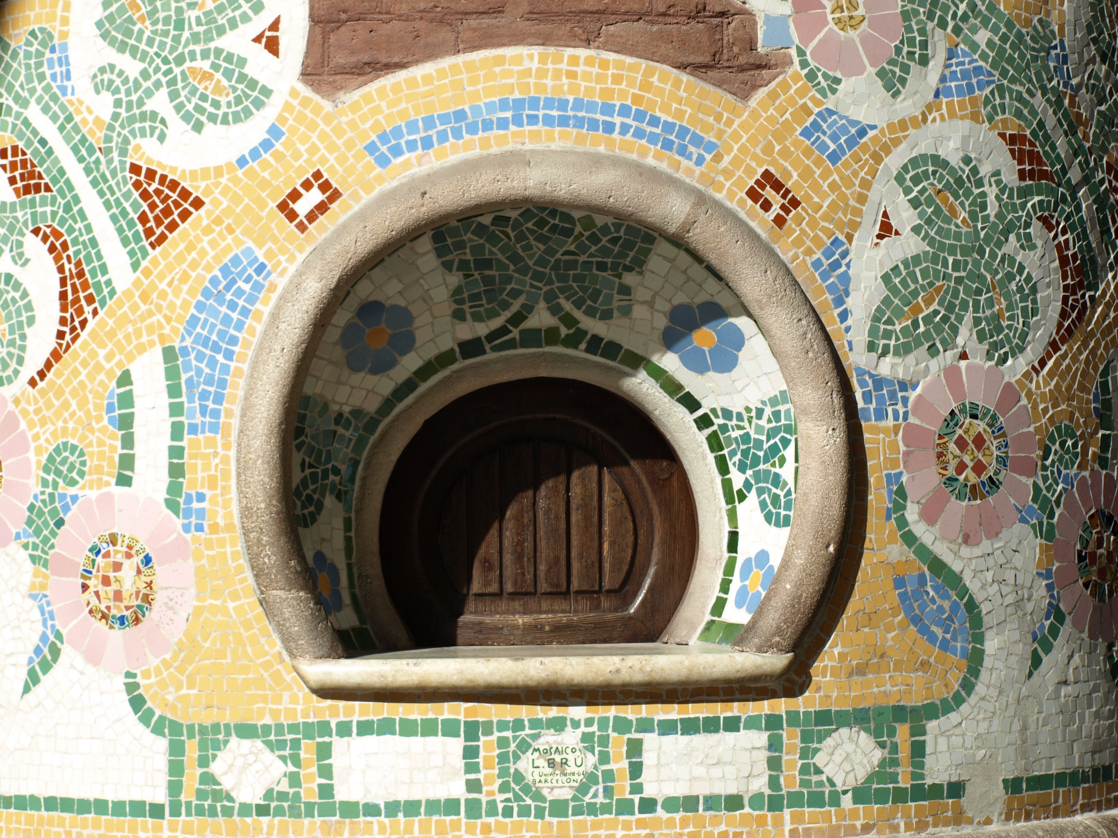
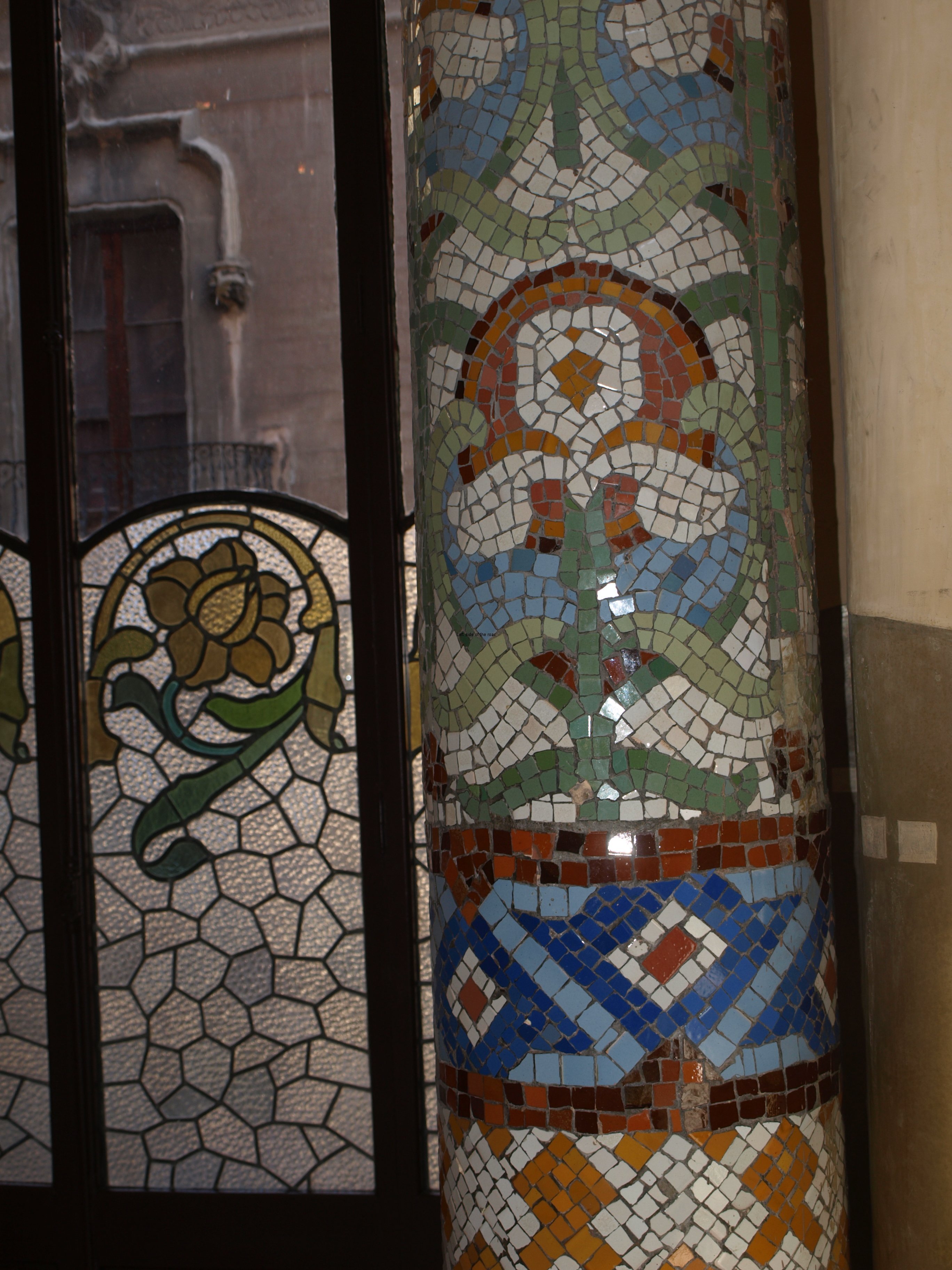
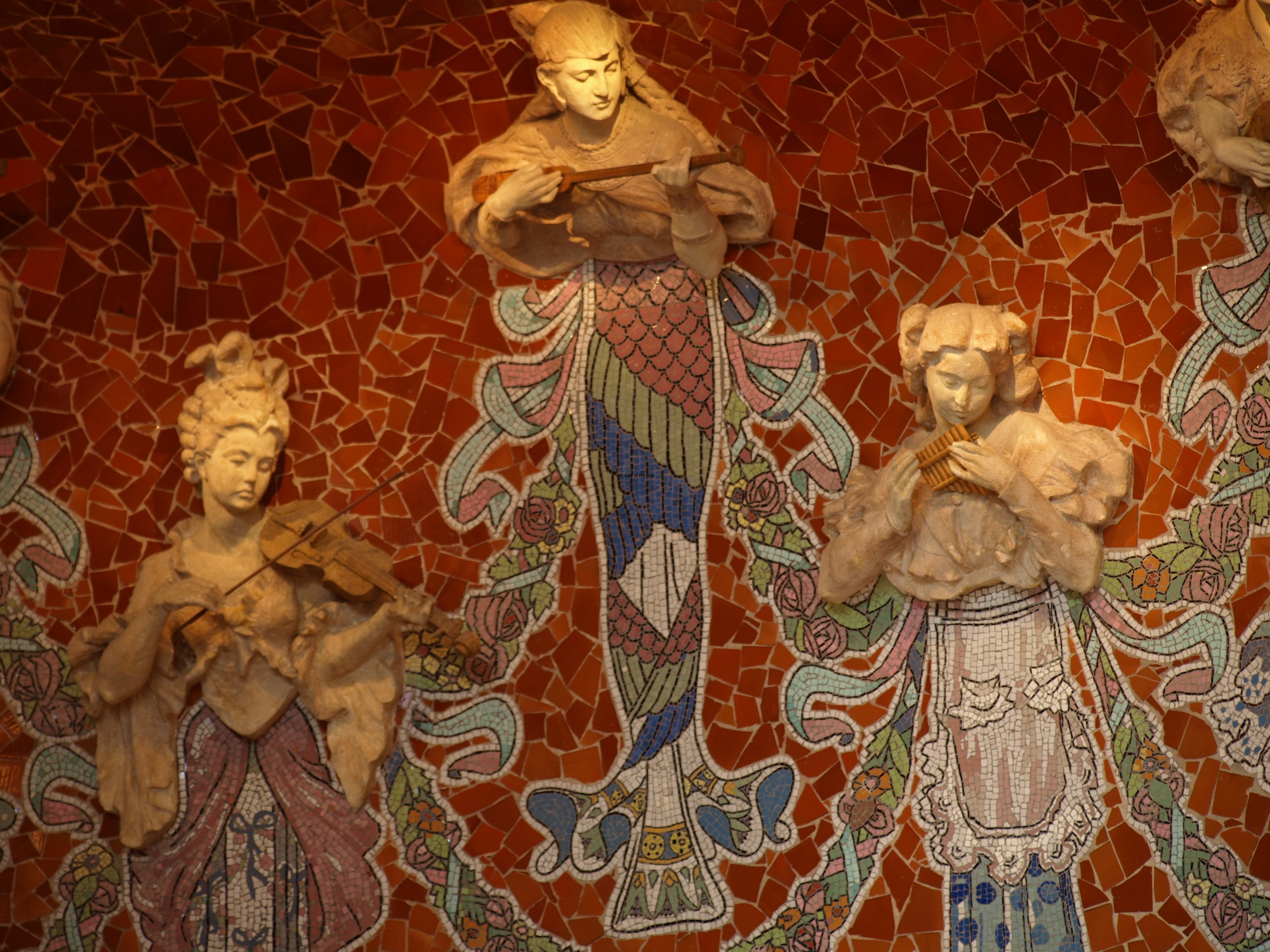
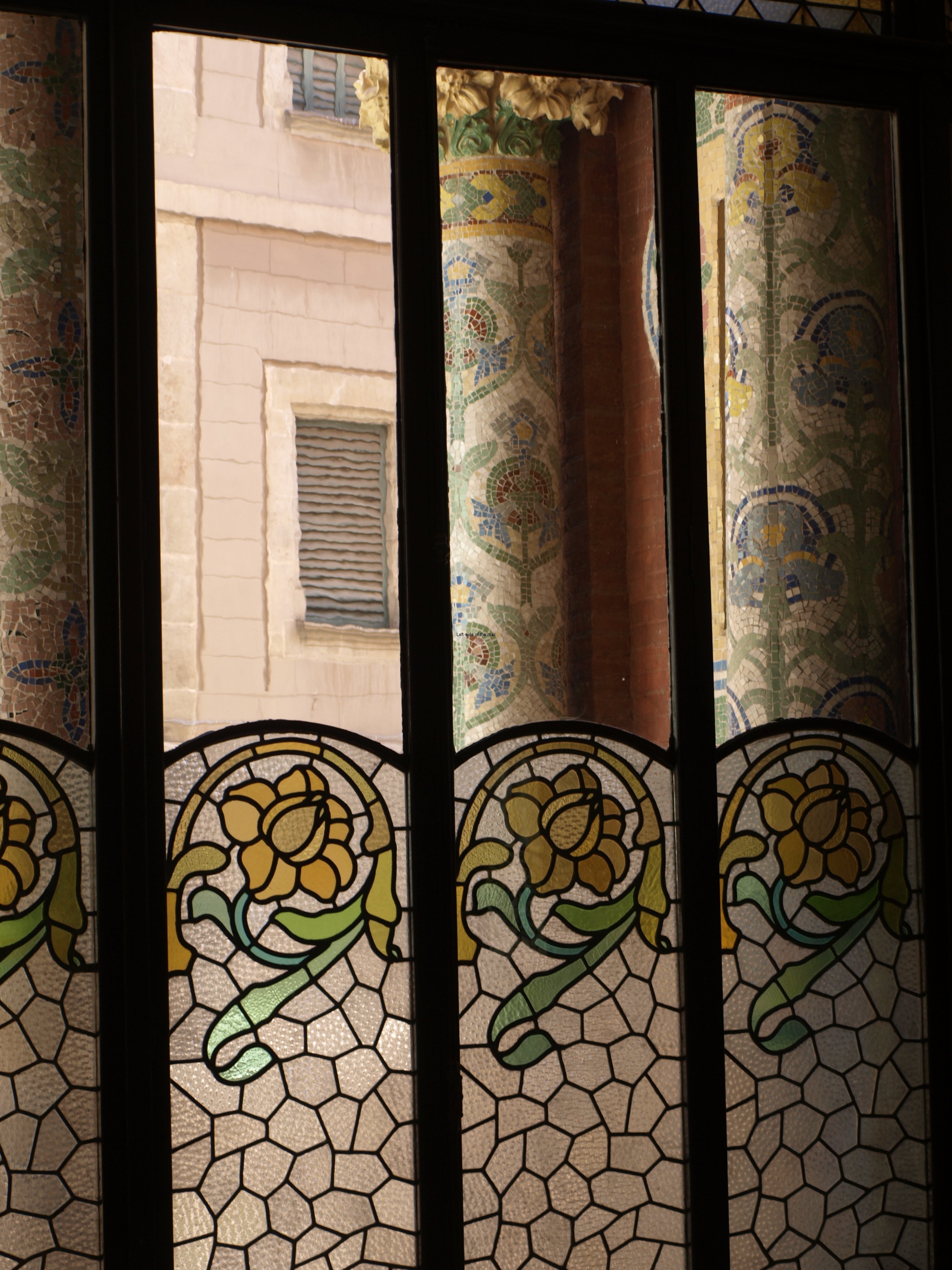
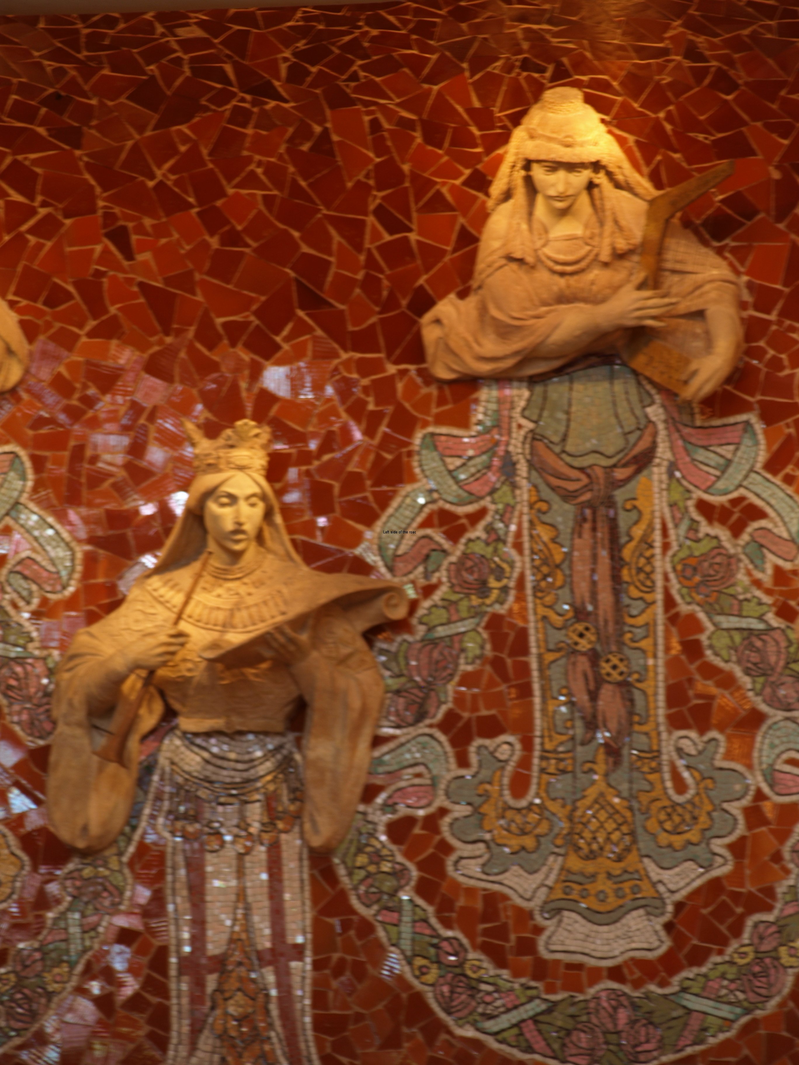
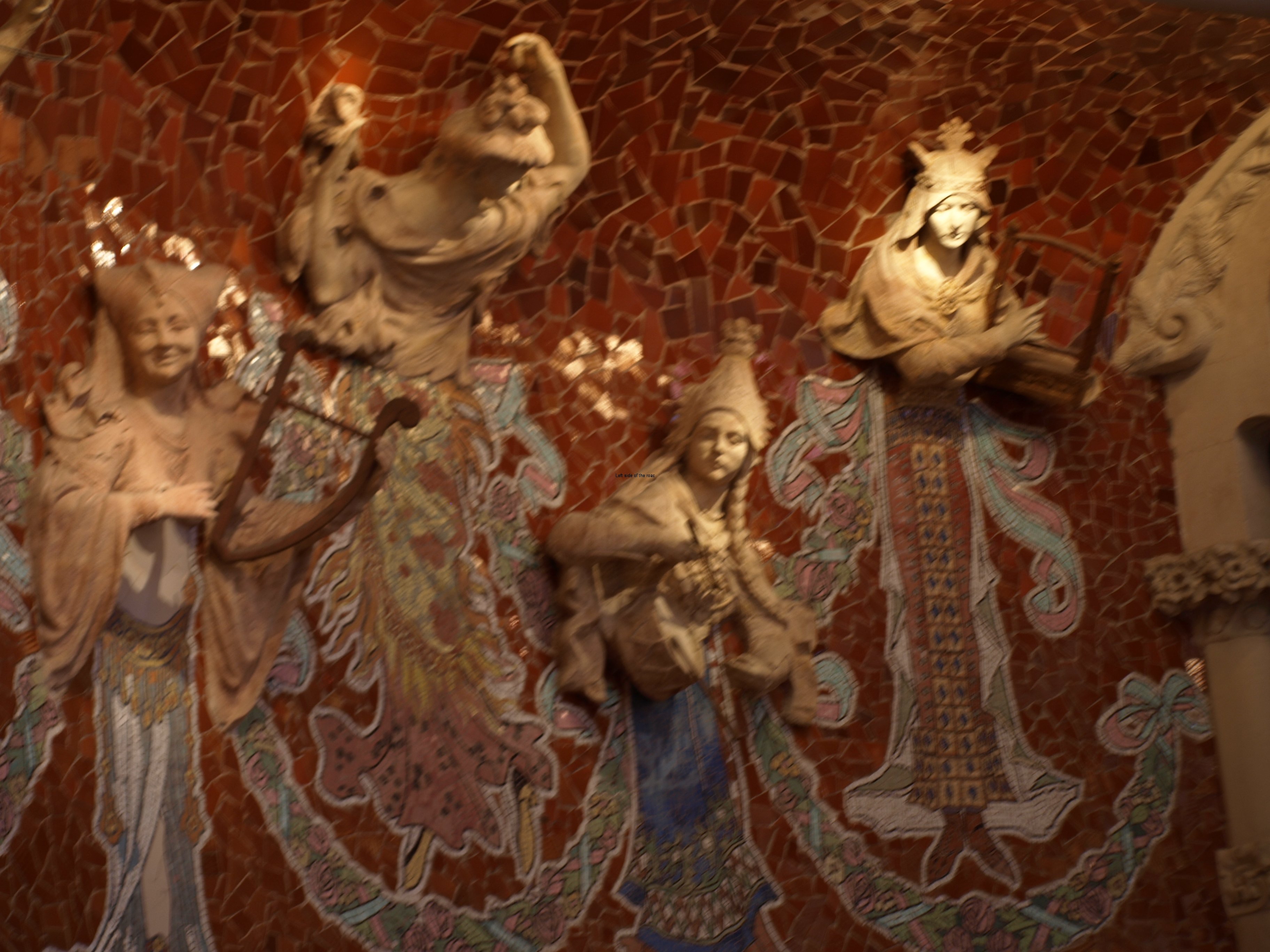
These mosaics, made from small pieces of ceramics and called ‘trencadis’ in Catalan, is very much a feature of Domènech i Montaner’s style of working. His style is much more in the tradition of the Roman mosaics where it’s possible to discern an image, be it of a plant, decorations on columns or pictures of choristers (as it is in the Palau de la Música). On the other hand Gaudí’s style was to break the tiles into larger pieces and creating a colourful design without necessarily wanting to represent anything identifiable – as is the case on the benches in Park Güell. His use of the smaller pieces on the Dragon on the fountain is to create colour rather than form as the creature is made out of stone onto which the tiles are fixed.

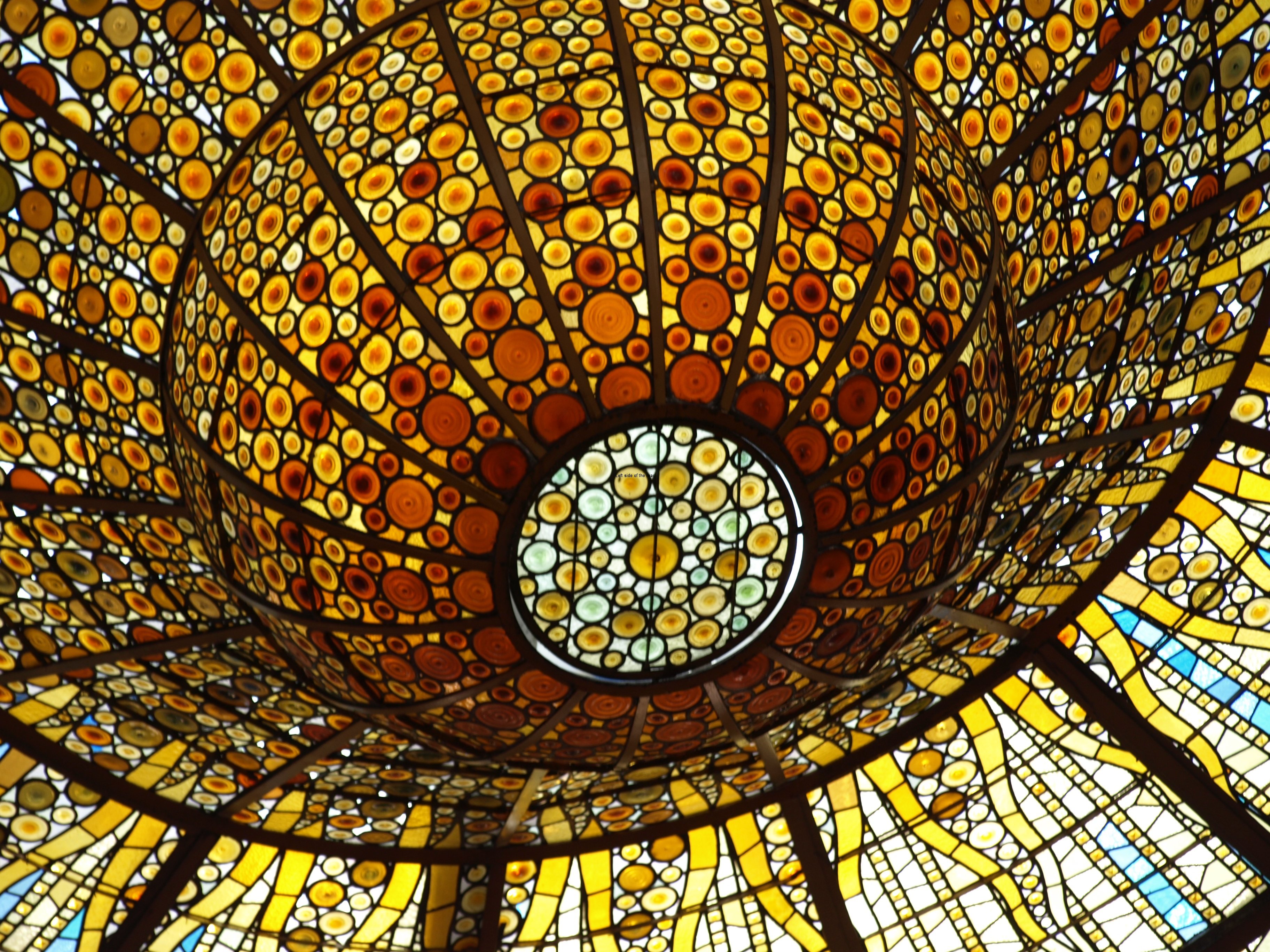
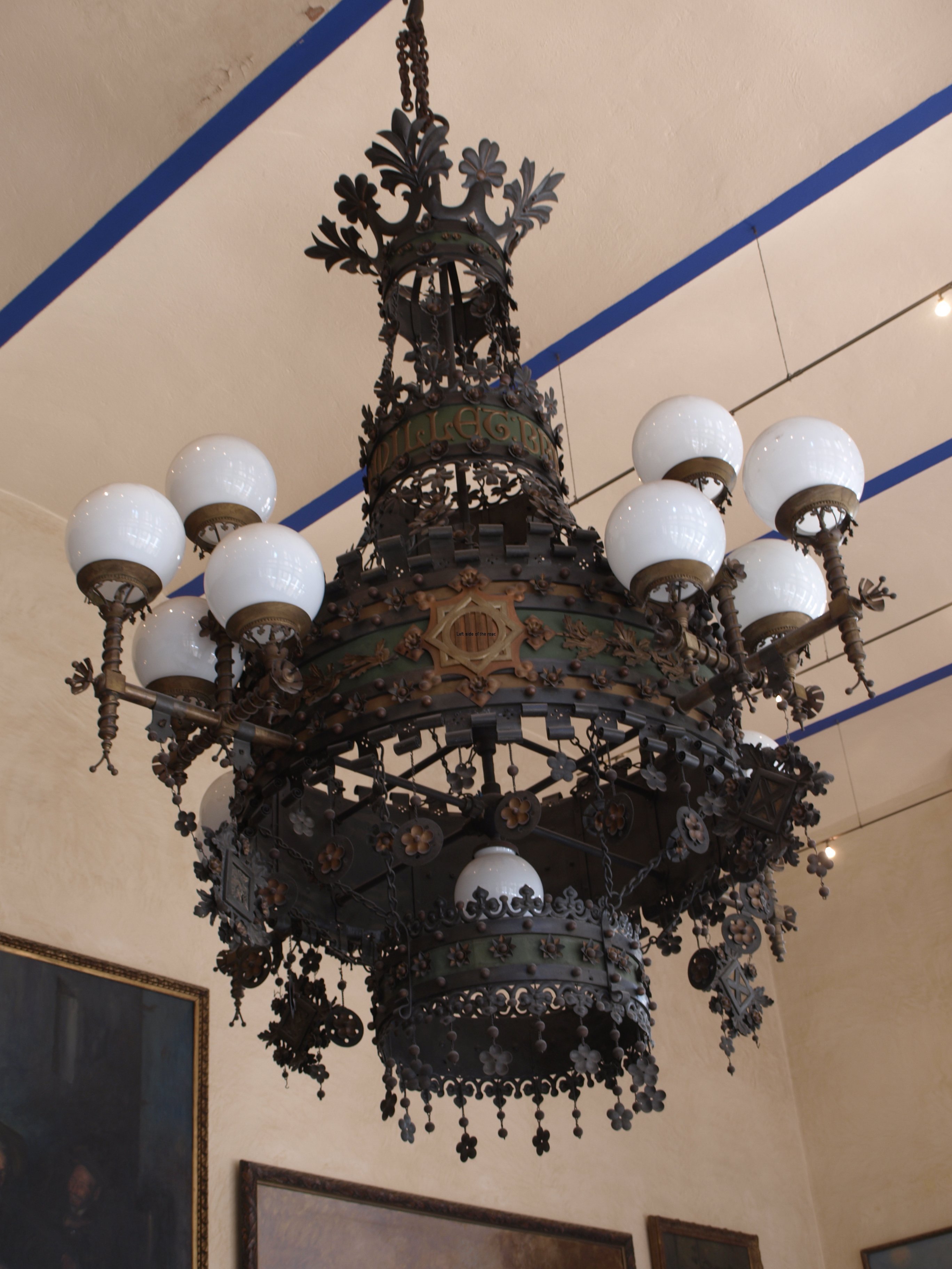
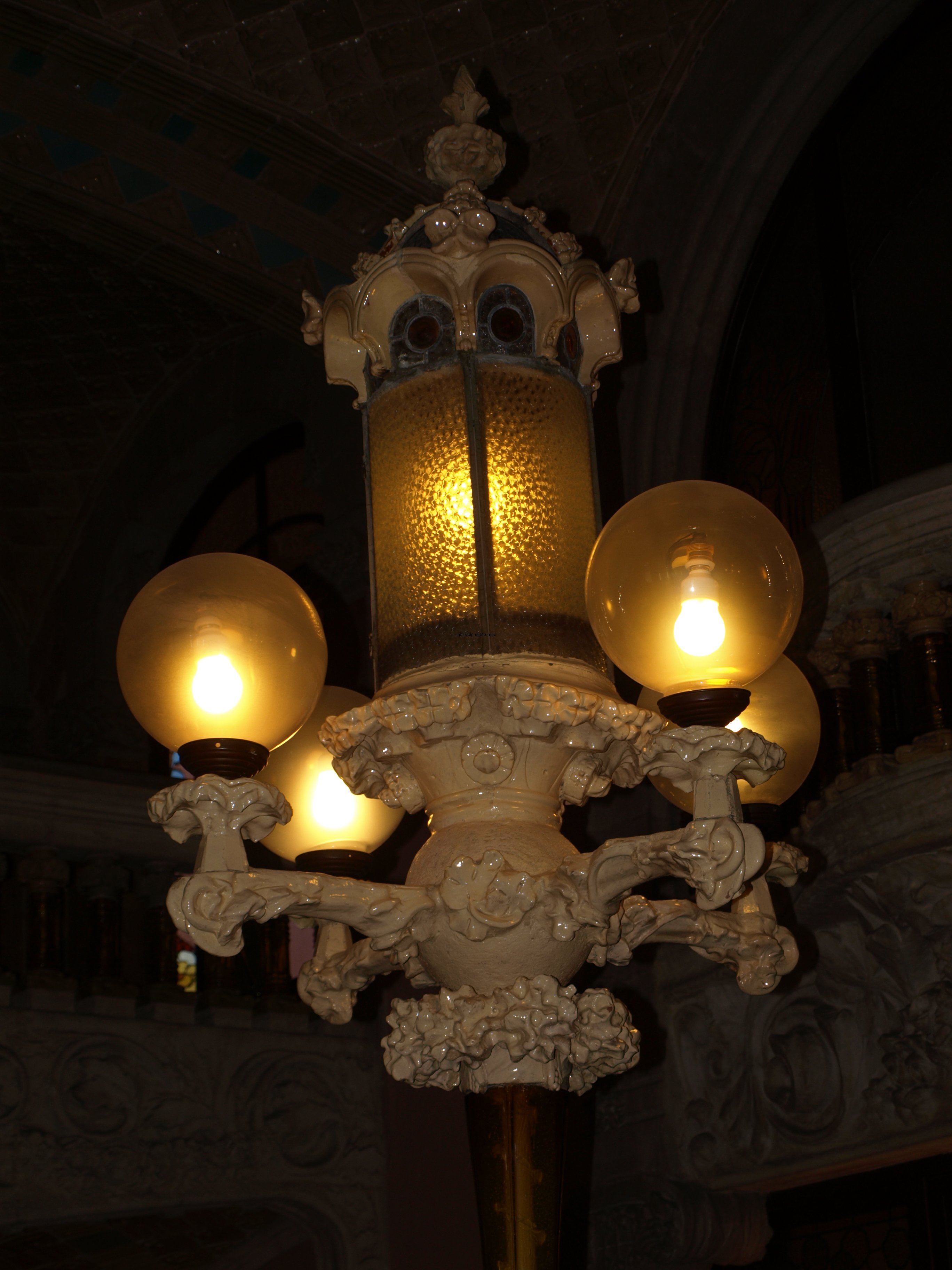
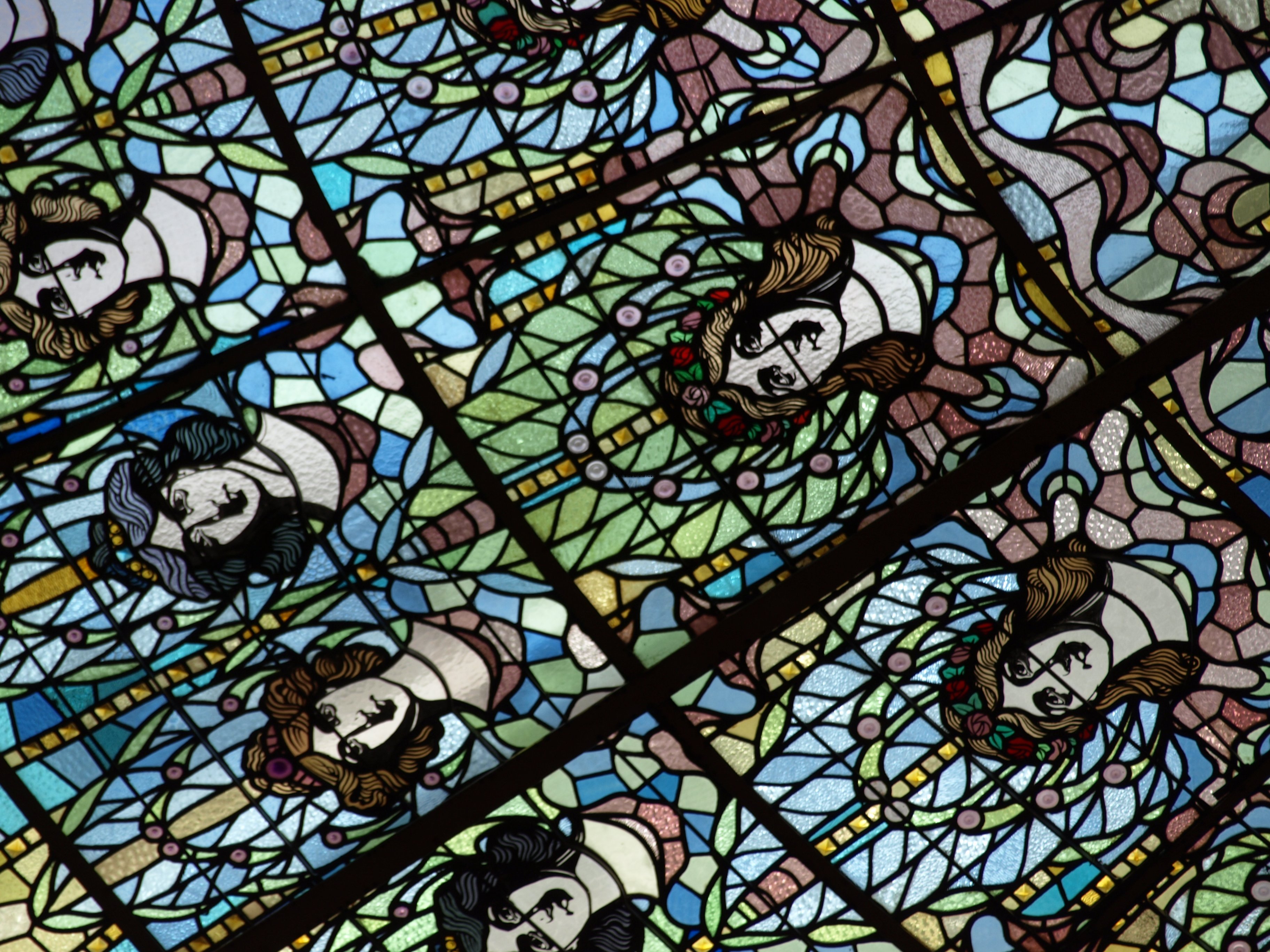
The other area of special note is the main stairwell immediately to the left as you enter the administration building. Here the supporting arches are covered with ceramic tiles and the spaces in between contain geometric mosaics made again by smaller pieces of, this time, white and beige tiles. Also interesting here is the skylight that’s very reminiscent of ‘The Sun’ above the main auditorium of the Palau de la Música. The large wrought iron lamp on the banister half way down is also a one-off in the building.

Hospital Santa Creu i Sant Pau - Main Stairwell

Hospital Santa Creu i Sant Pau – Main Stairwell

In order to get to the other buildings you head down into the basement and then along part of the network of underground passageways that unite all the separate parts of the original hospital. You can’t explore all of these as the pavilions that are out in the garden are either used by different organisations or have yet to be restored. Nonetheless you do get an idea of what Domènech i Montaner was aiming for, keeping all the servicing of the hospital’s requirements underground and creating the ability to get to all the pavilions without having to pass through or disturb any of the others.

Hospital Santa Creu i Sant Pau - Basement

Hospital Santa Creu i Sant Pau – Basement

Once outside the main administration building it’s easy to see why Sant Pau was sometimes referred to as a ‘garden hospital’. In fact, if you didn’t know the different buildings were part of a medical complex you would be hard pressed to come to that conclusion. Used, as we are now, to generic, functional and normally boring and uninteresting structures where we go to have our medical requirements fulfilled (the new hospital in Reus being a noteworthy exception to this ‘rule’) the buildings seem to be more like homes for the rich than wards and laboratories.

Although I find their exteriors fascinating I wouldn’t have liked to have spent any length of time either working in them or being a customer (what used to be called a ‘patient’). Photographs of the wards make them seem cold and austere, however much they might have been ‘state of the art’ on their completion in 1930.

Only a few of the buildings have been fully restored and now have a new lease of life as offices for different organisations that look for attractive pictures to put on their publicity. When I visited it was part of the open days and some of these organisations allowed people to look into their space but I assume that on a regular basis it would only be the outsides that are part of the tour. But the outsides are enough and stylised plants and fruit made from colourful tiles sits well with the orange trees below.

Hospital Santa Creu i Sant Pau - Garden Pavilions

Hospital Santa Creu i Sant Pau – Garden Pavilions

Also worth looking for whilst out in the garden are the different mosaics which decorate the sides of some of the pavilions. There are a couple of Sant Jorge and also (just above the entrance to the obligatory souvenir shop cum exit) depictions of the planning of the project and the laying of the first stones.

Hospital Santa Creu i Sant Pau - Mosaic

Hospital Santa Creu i Sant Pau – Mosaic

At the moment only eight of the buildings have been fully renovated. The initial plan, for which a budget of €100 million has been allocated, takes in 12 buildings and they are those around the central building of the garden as well as the administration building itself. That still leaves 15 (assuming they have all survived into the 21st century) and some of them are very large indeed so whether the finance will be there in the future must be in some doubt. The present funding was secured before everything went down the pan and we are now rewarding the bankers with ever-increasing bonuses means there’s less for other projects.

Hospital Santa Creu i Sant Pau - Pavilions

Hospital Santa Creu i Sant Pau – Pavilions

I’ll finish this introduction with a couple of anecdotes.

During the Spanish Civil War the hospital was taken over by the Republican local government of Barcelona. As in all civil wars things get dirty and the antagonism between the Catholic Fascists of Franco and the atheist Republicans was intense. Church buildings were burnt by the Republicans and Catholic Priests blessed and gave absolution to the Fascists as they murdered those who were fighting in defence of the legitimate government. So it’s no surprise that this had an effect on the hospital.

The religious name was changed from Santa Creu I Sant Pau to the General Hospital of Catalonia. All the pavilions had been given religious names based on Saints and the Virgin Mary (as they are now) and these were replaced by numbers. This was the case until February 9th 1939 when matters reverted to the pre-war condition with the entry of the Fascists into the city of Barcelona.

The young Pablo Picasso was friendly with one of the surgeons of the hospital and for some reason when he went to Sant Pau to meet his friend in 1903 they decided to visit the mortuary. A women that he saw there inspired Picasso to paint La Dona Mort (The dead Woman) which is an example from his ‘Blue Period’.

Although the queues were literally around the block between February 25th and March 16th, 2014 when it was free to enter as a celebration of the completion of a significant part of the restoration the Sant Pau Recinte Modernista (as it is now called) still hasn’t got into the guide books and won’t be attracting the same crowds as other Modernist sites in the city. It’s still possible to get tickets at very short notice so go there soon before it gets swamped. As the plan is to make money from the likes of conferences and exhibitions in the newly renovated space you would be well to check the news section on the website to make sure access is possible when you might want to visit.

Location:

Sant Pau Art Nouveau Site
C. Sant Antoni Maria Claret, 167
08025 Barcelona

Website:

Sant Pau Recinte Modernista

How to get there:

Metro (L5): Sant Pau / Dos de Maig

Visits:

SELF-GUIDED

Cost and Timetable:

General: €8

Over 65, Aged 16-29 and Disabled: €5.60

Under 16: Free

November – March

Monday to Saturday          10.00 – 16.30

Sundays and holidays       10.00 – 14.30

April – October

Monday to Saturday           10.00 – 18.30

Sundays and holidays        10.00 – 14.30

GUIDED

Cost and Timetable:

General: €14

Over 65, Aged 16-29 and Disabled: €9.80

Under 16: Free

November – March

Monday to Saturday        12.00, 13.00, 16.00

Sundays and holidays     12.00, 13.00

April – October

Monday to Saturday         12.00, 13.00, 16.00, 17.00

Sundays and holidays      12.00, 13.00

Closed:

1st and 6th January, 25th and 26th December

Free:

25th January, 12th February, 23rd April, 24th September, first Sunday of the month

Book Online HERE

More on Catalunya/Catalonia

Palau de la Música Orfeó Català – Barcelona

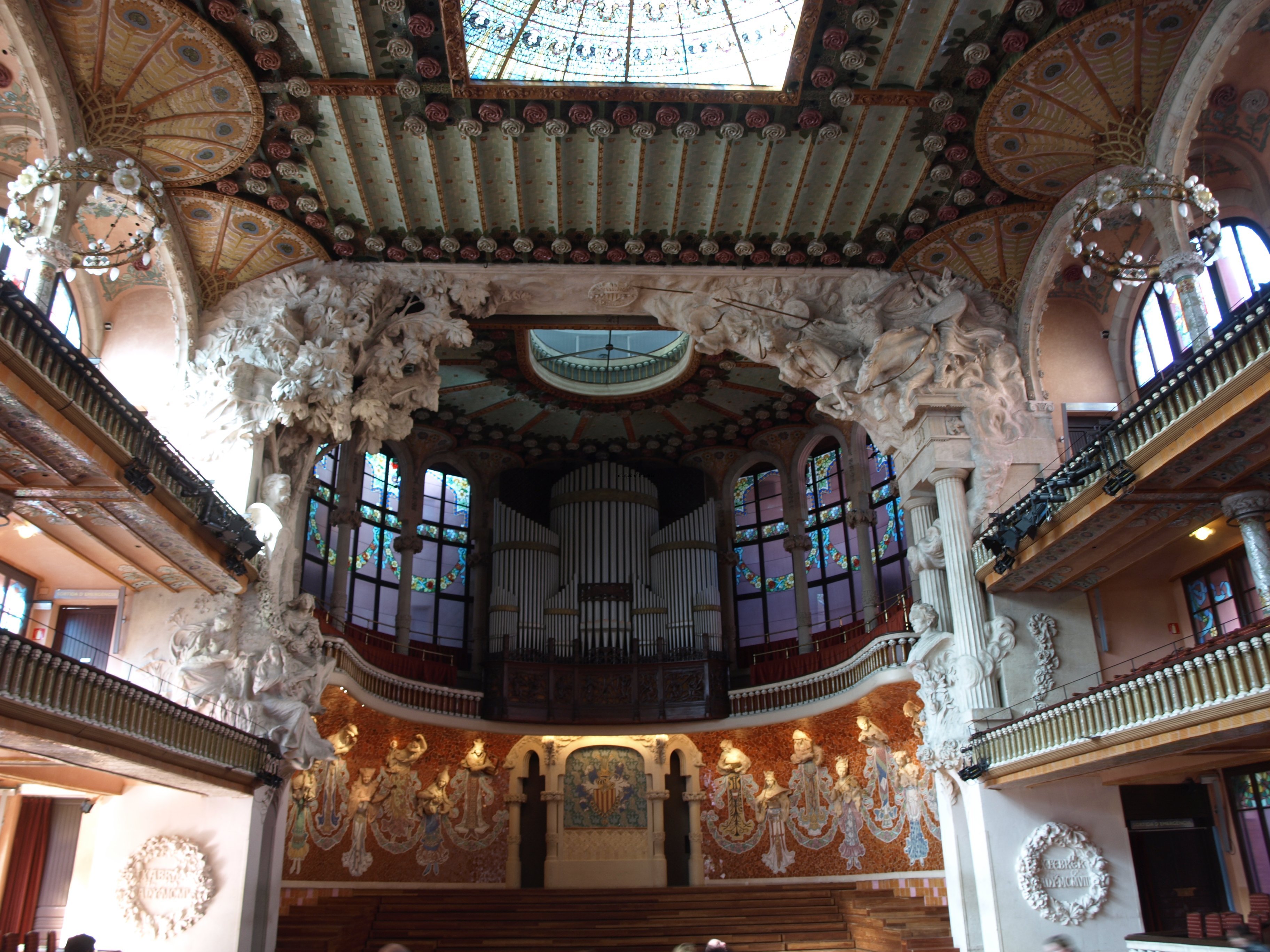
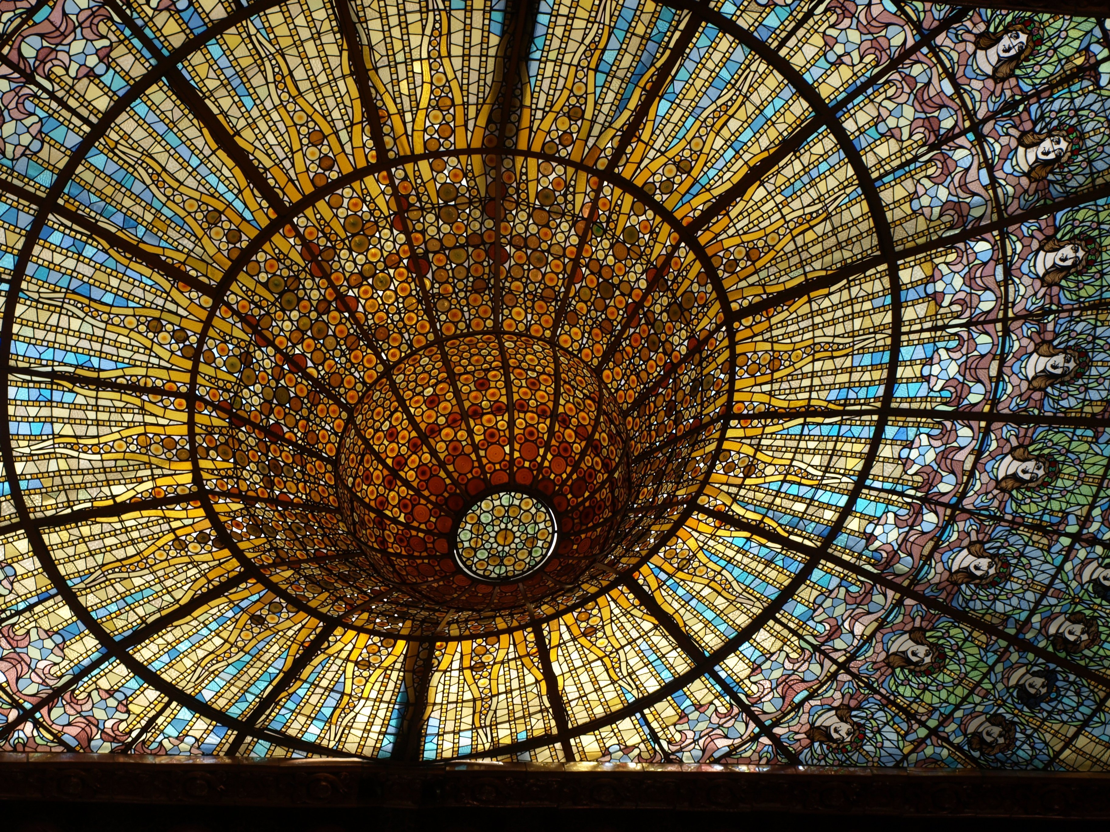
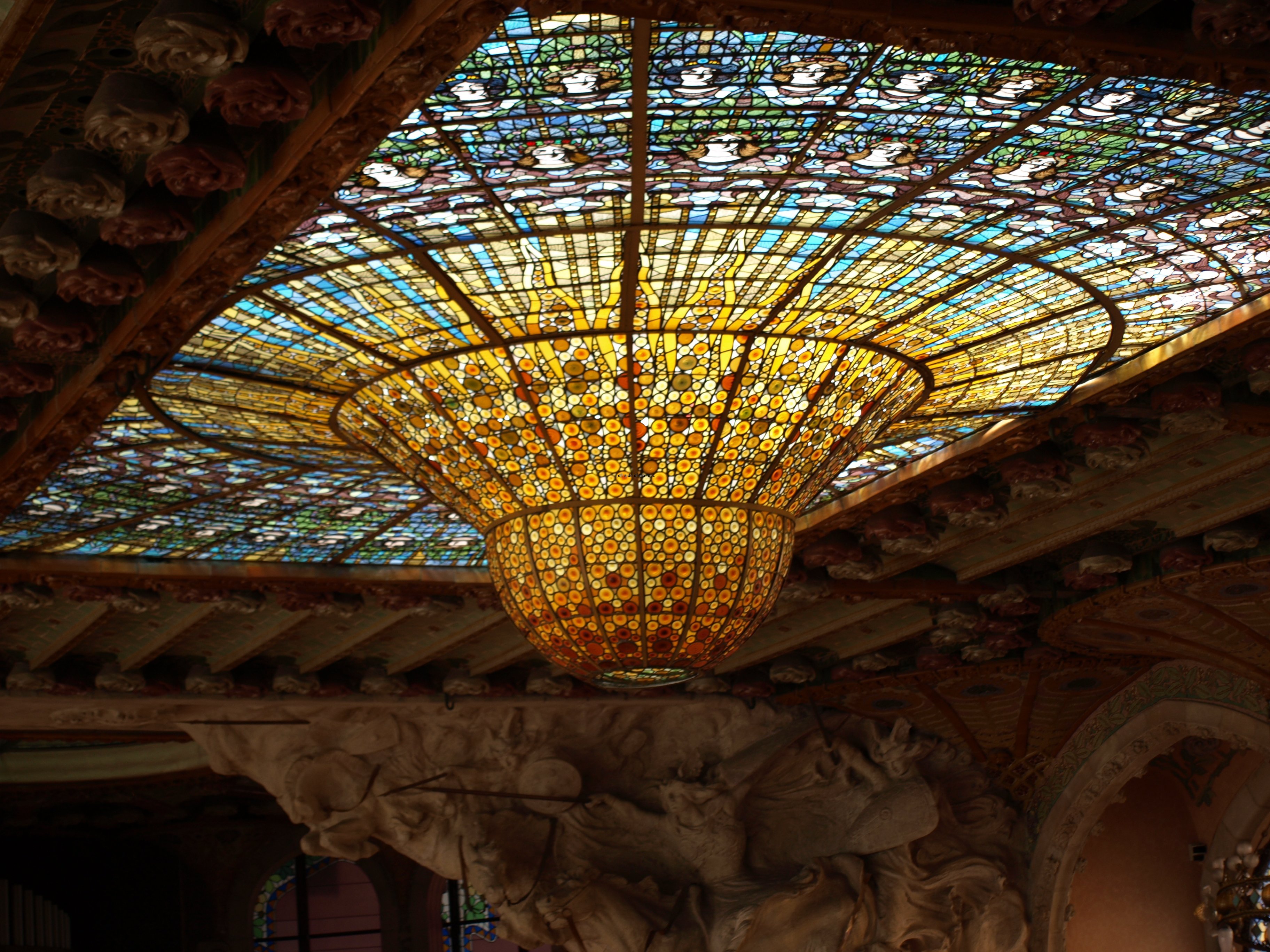
'The Sun' Concert Hall - Palau de la Música Orfeó Català

‘The Sun’ Concert Hall – Palau de la Música Orfeó Català

More on Catalunya/Catalonia

Palau de la Música Orfeó Català – Barcelona

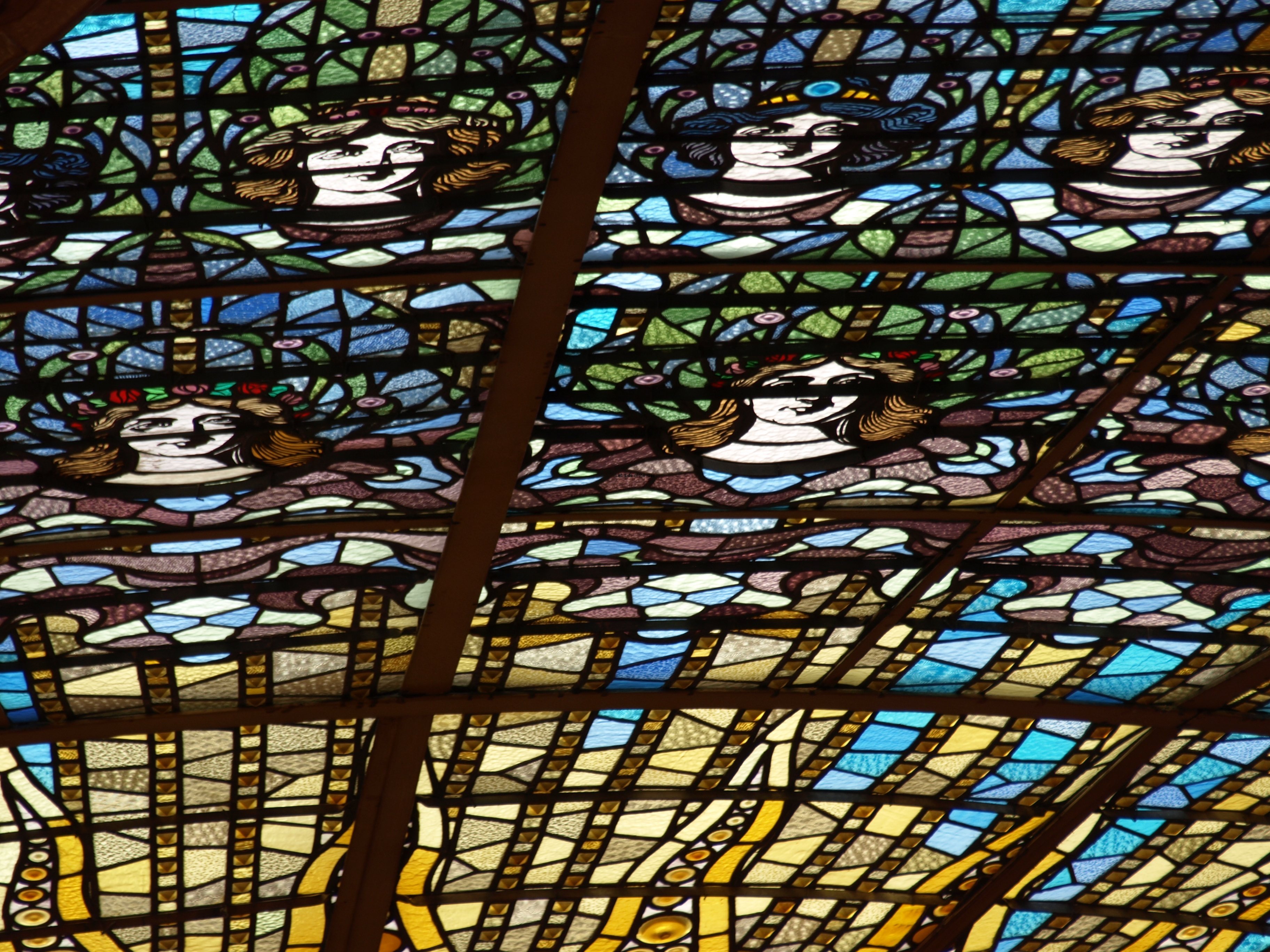
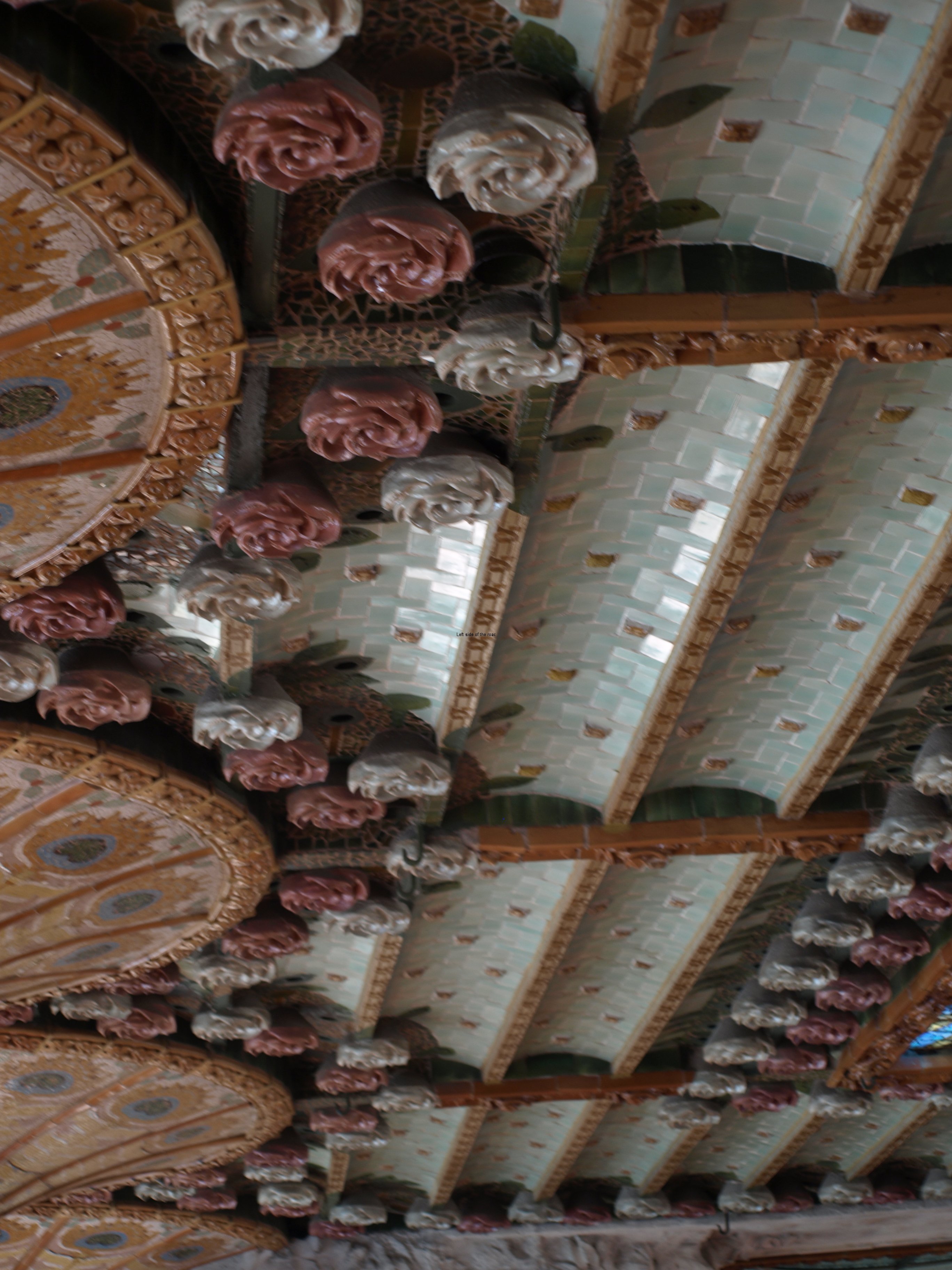
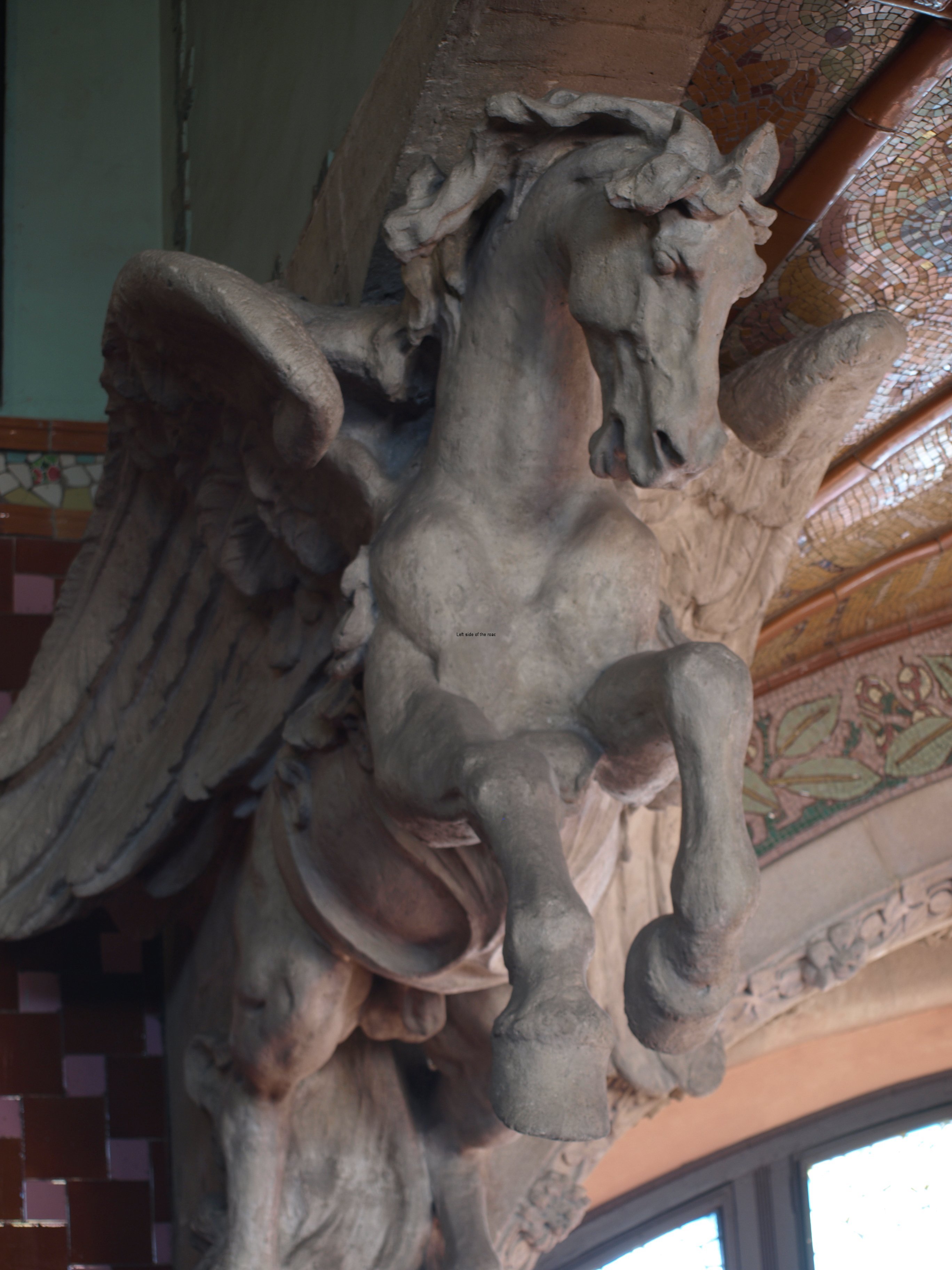
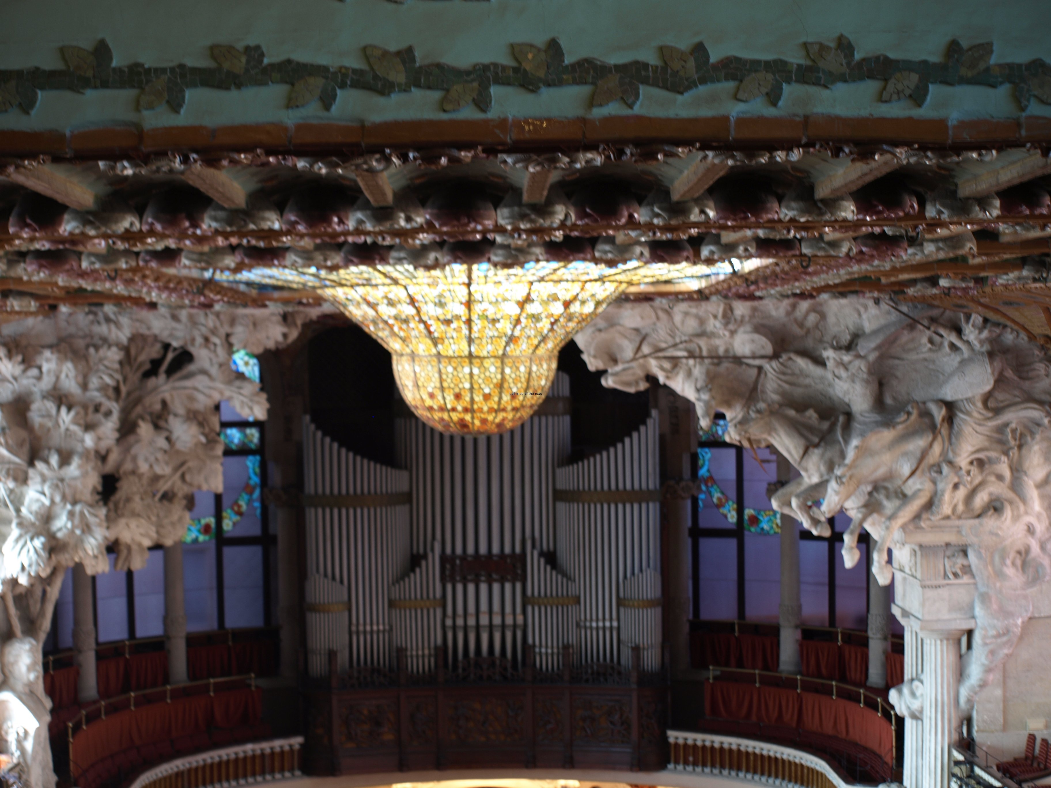
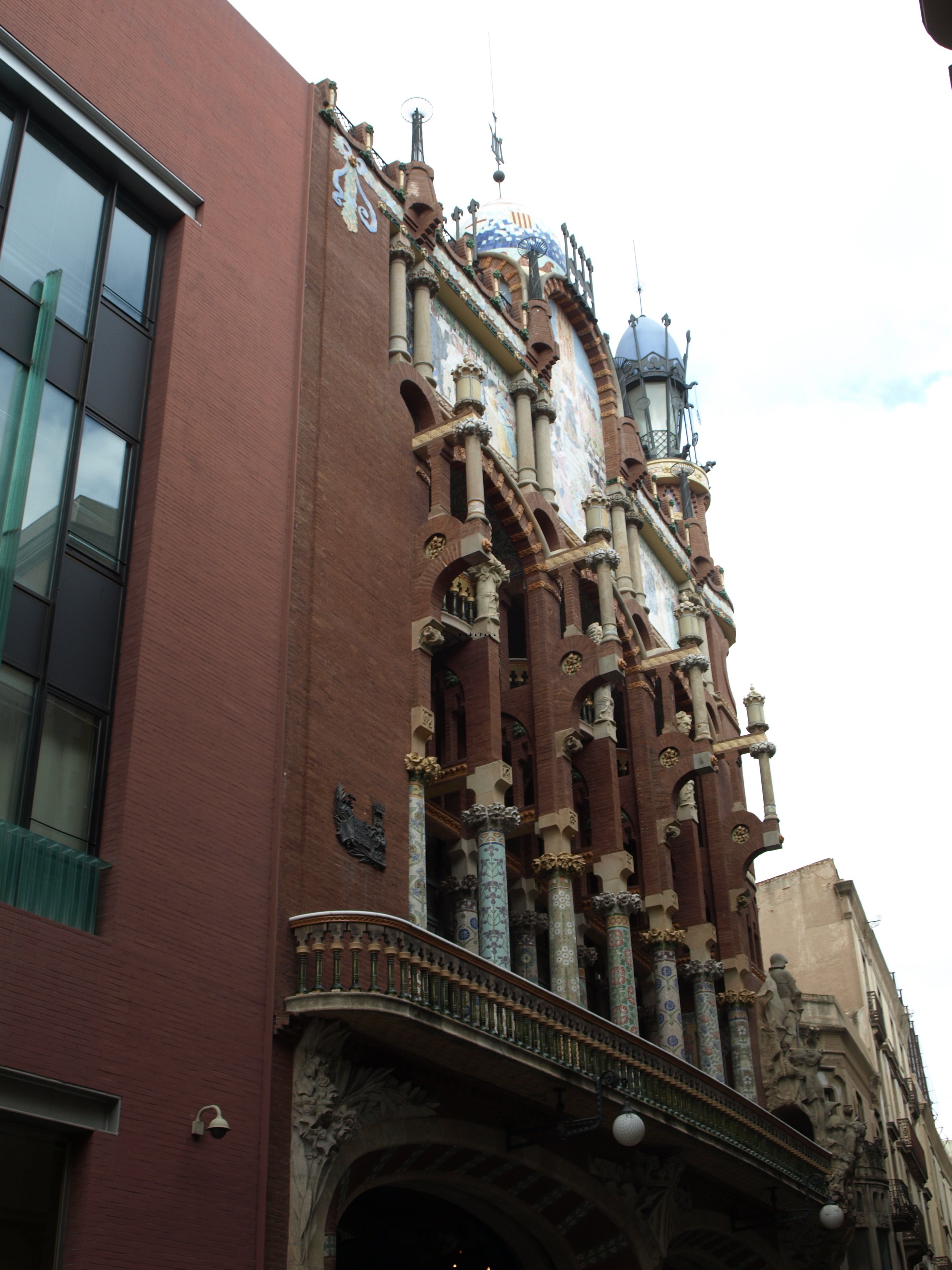
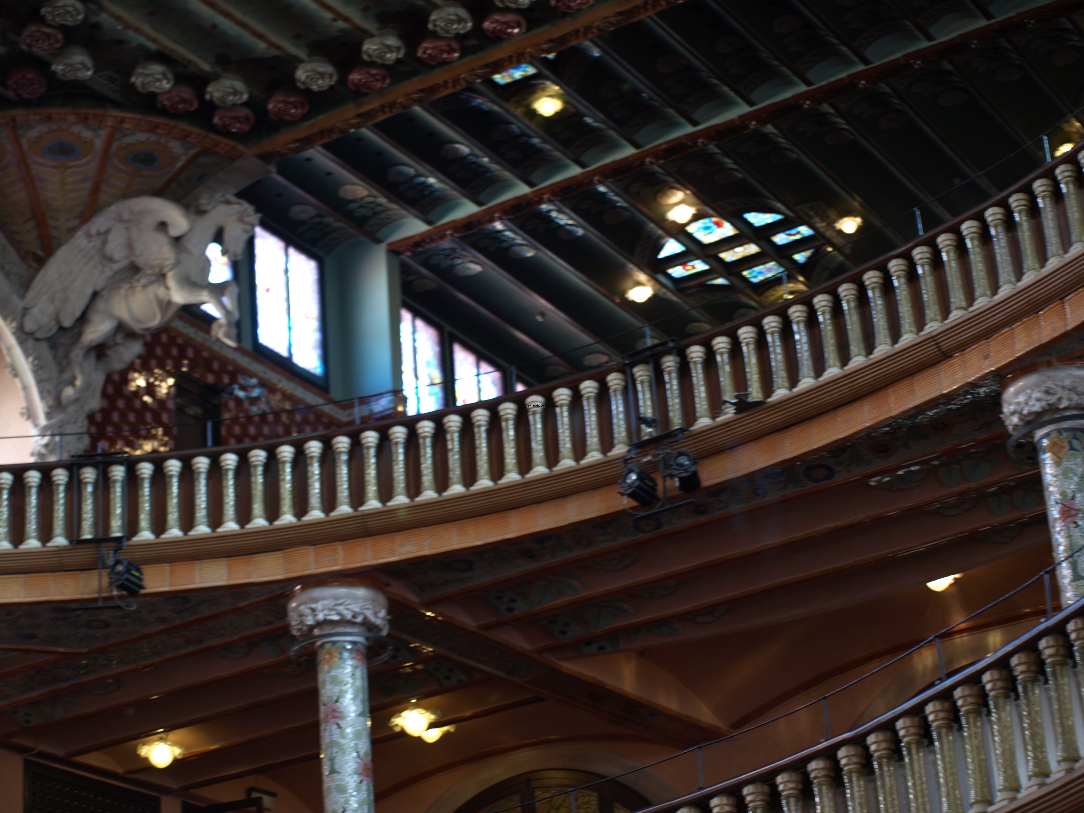
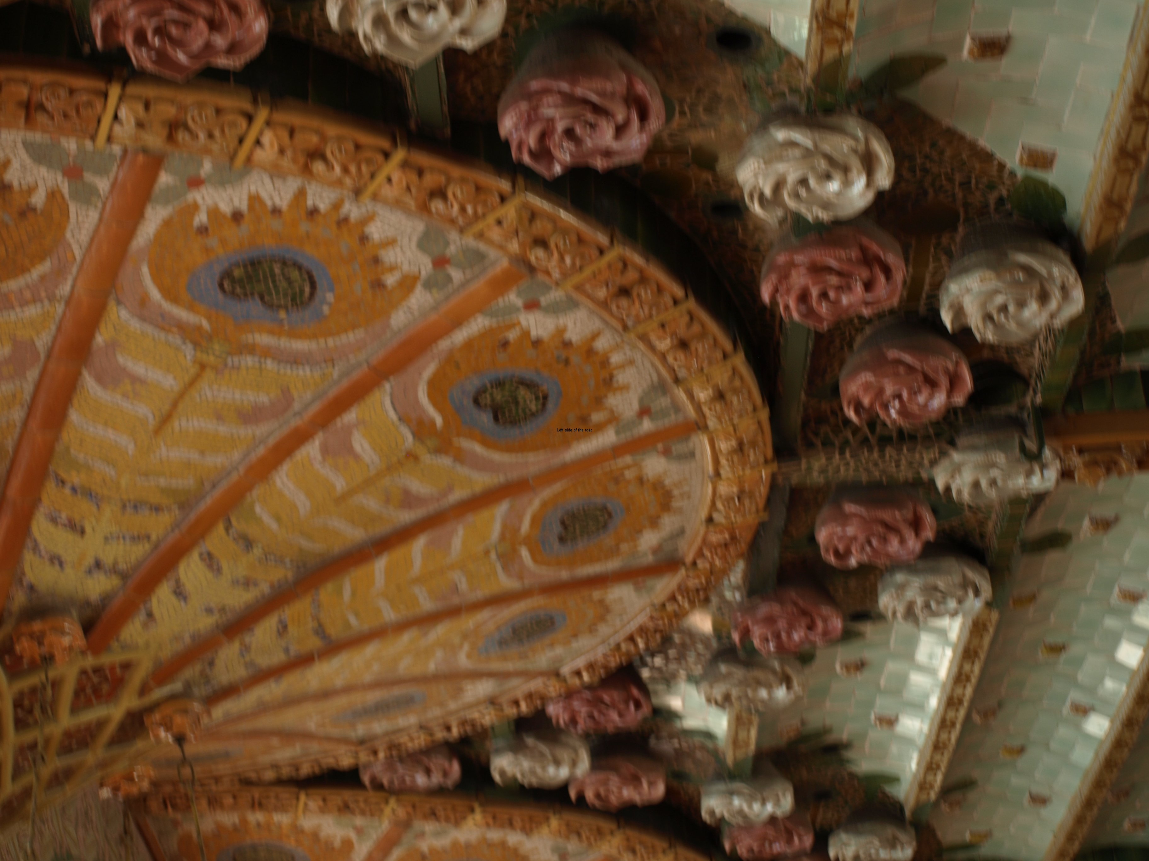
If you have any interest at all in Modernisme (the Catalan name for what is called Art Nouveau in Britain) then any visit to Barcelona has to take in the unique Palau de la Música Orfeó Català at the Via Laietana end of the narrow Sant Pere Més Alt. The work of the Barcelonan Moderniste architect, Lluís Domènech i Montaner (whose other great monument to Modernism is the Hospital de la Santa Creu i Sant Pau) this one building encapsulates all the aspects which arose time and again in the short 20-30 year period of Moderniste dominance which straddled the 19th and 20th centuries. Love it or hate it you can’t ignore it!

Here I don’t intend to give a history of the building, facts and figures and all the rest. Others have done that before with more authority and knowledge and all I would be doing is paraphrasing what they’d already written. Here I want to address a few matters that came to me after my visit in February 2014.

If Modernisme was to have a revival in Barcelona in the 21st century it could never take off in the same way that it did in the 1880s. Most of the skills that were used in the buildings that litter the Eixample district (and which appear in other locations in the city and Catalonia in general) have been lost in the intervening years and bringing together craftsmen with such a variety of skills would be a Herculean task in itself.

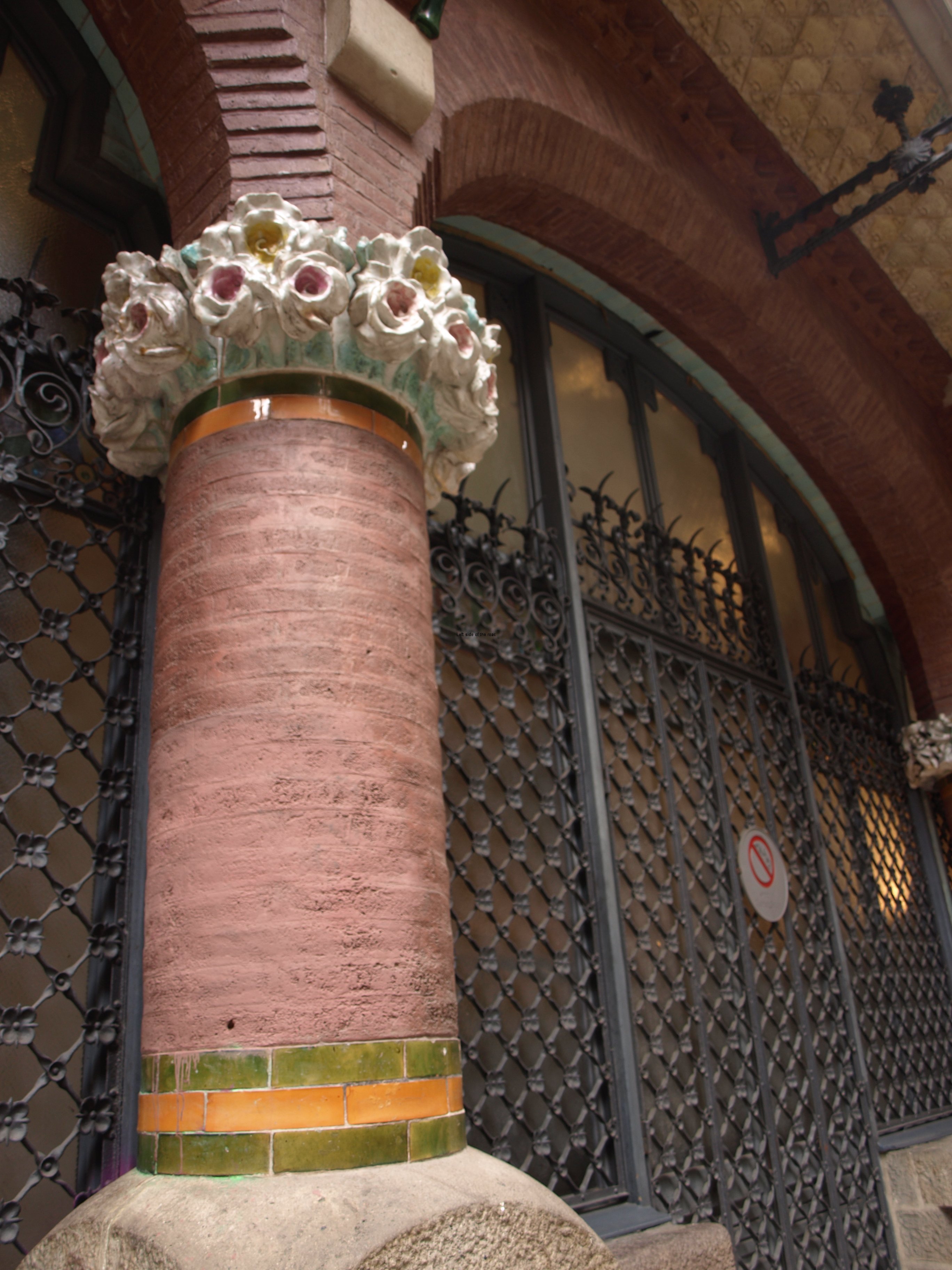
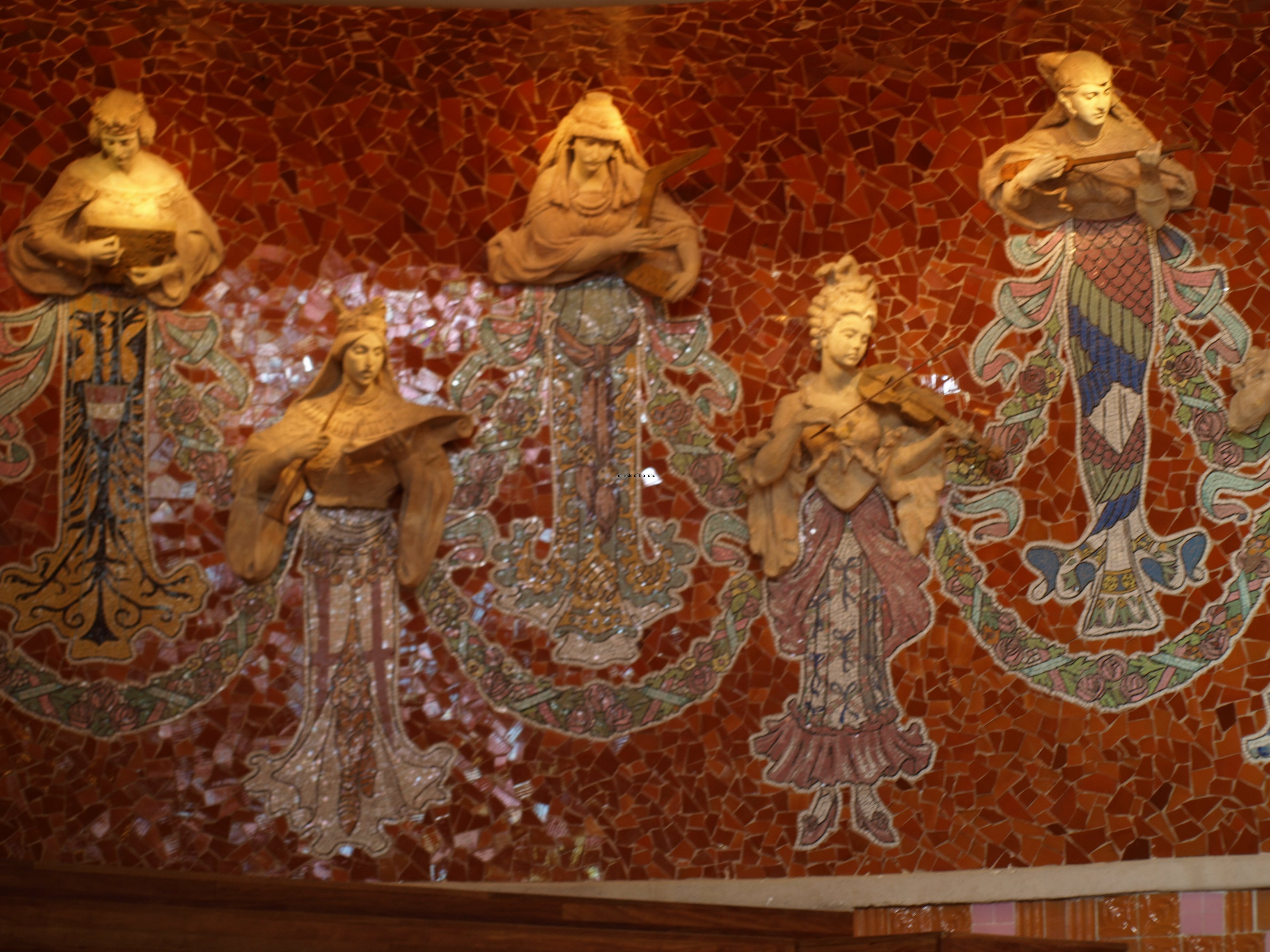
The lack of skills is one thing, the lack of materials is another. All the materials that were used in buildings such as the Palau de la Música were sourced and manufacture locally. At the end of the 19th century Barcelona had become a centre for ceramics and provided the Moderniste architects an inexhaustible supply of materials for the trancadís (which means broken) style of using tiles on curved surfaces so beloved by Gaudí – as is seen in Park Güell – and by Domènech i Montaner’s construction for the Orfeó Català.

The other materials used extensively included wrought iron, bricks and coloured glass all again major industries in Barcelona and the surrounding areas at the turn of the 19th/20th centuries. The de-industrialisation that Barcelona (as have so many other European cities) has undergone in the last 30 years or so means that all such material would have to be brought in from abroad, most likely from China. And China is now probably the only country in the world which could produce such buildings and I wouldn’t be surprised to read that some opportunistic capitalist in the once great Socialist country is planning to open a Moderniste theme park.

When I had the opportunity to go inside the Palau de la Música in the late 90s there were only something like one or two chances a week. If you didn’t book well in advance there was little chance of getting in. I also think, but can’t be sure, that the numbers in those groups were relatively small. Now there are tours on the hour and they take up to 60 people at a go. At €18 a go that adds up to a lot of money.

One of the consequences of this huge rise in visitors is a dumbing down of some of the history of the building. When it was started in 1905 Catalan nationalism was big and as well as the influences from nature, the moving away from the man-made straight line with a greater use of curves and the depictions of women as an integral part of the designs this nationalism became a fourth strand in the Moderniste architects armoury.

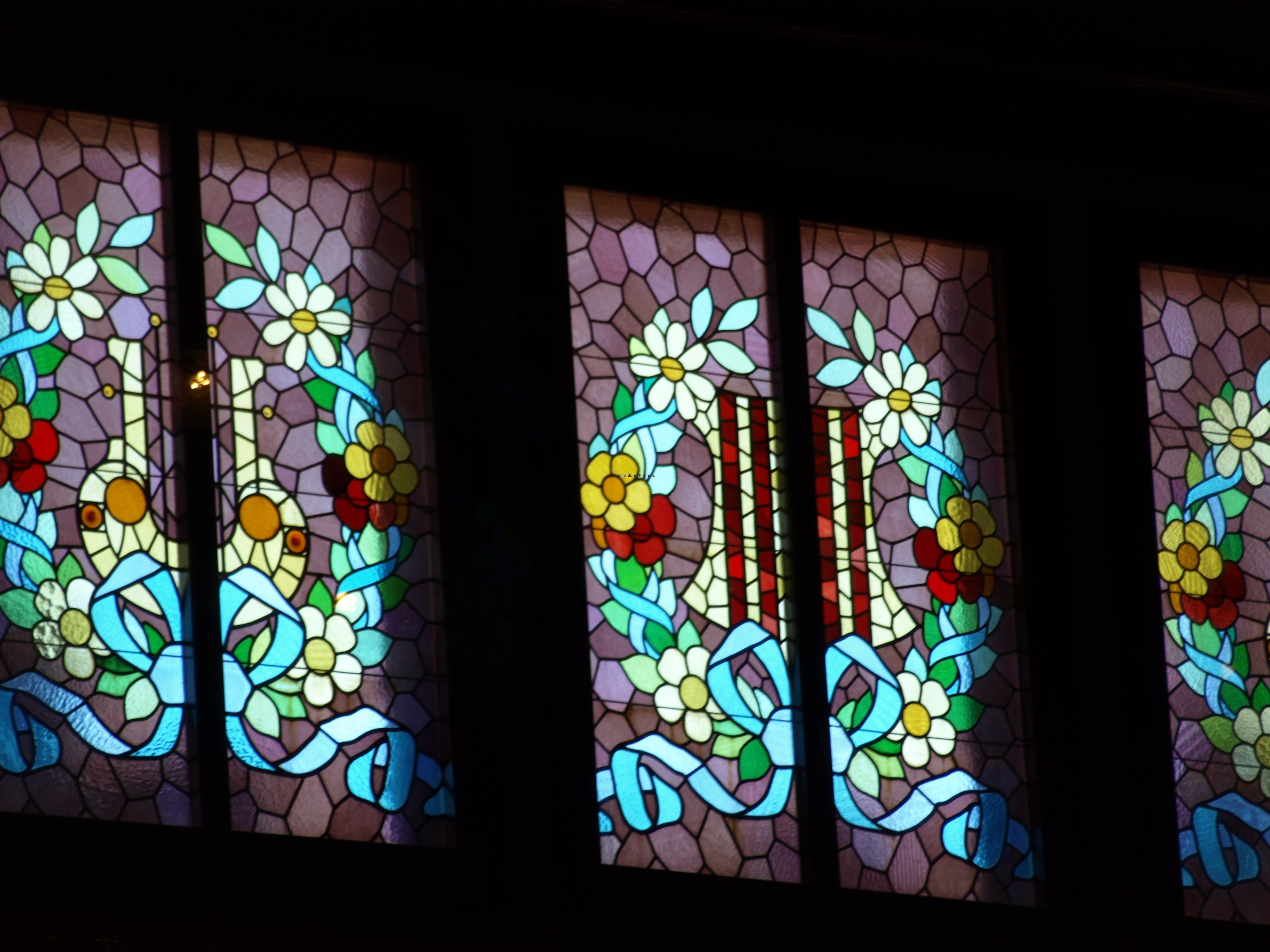
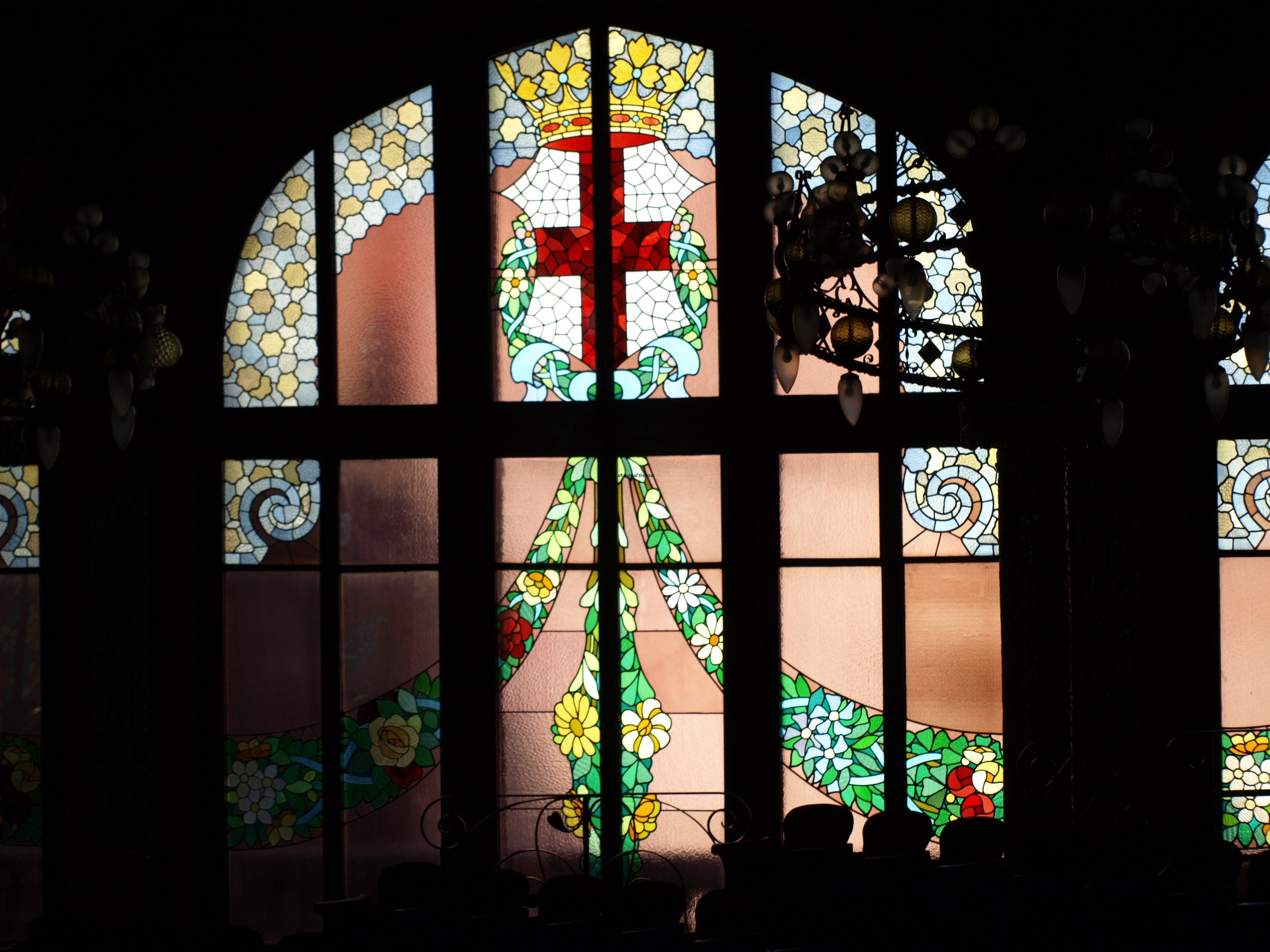
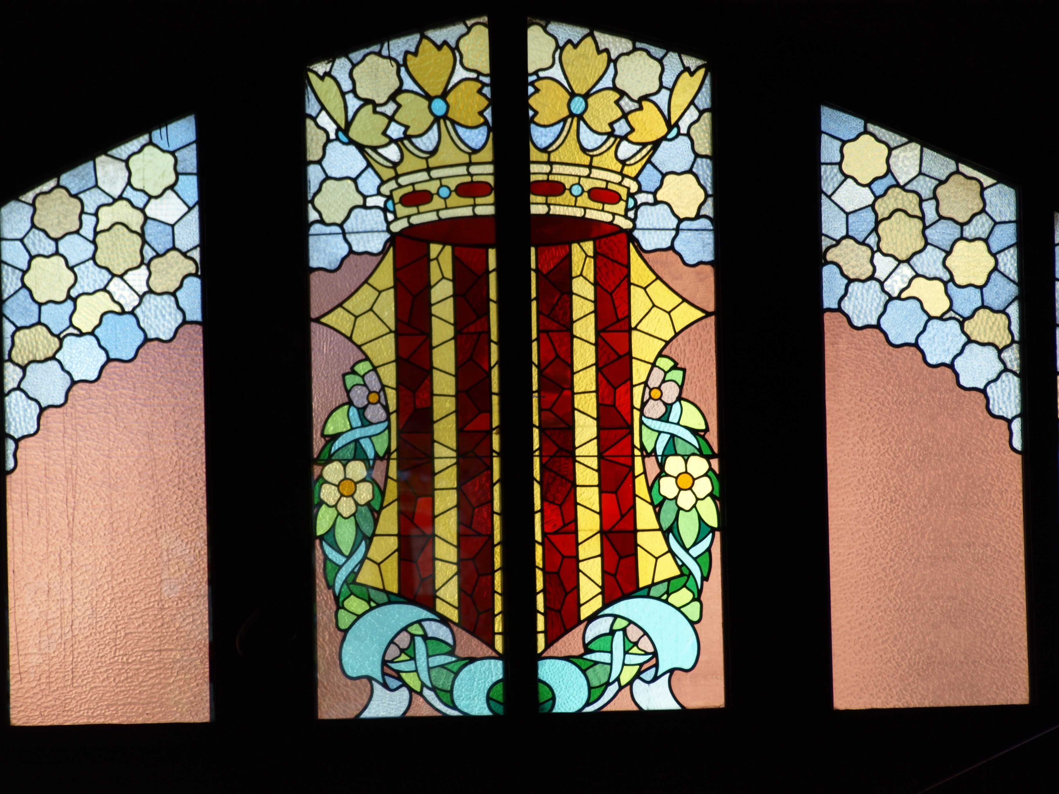
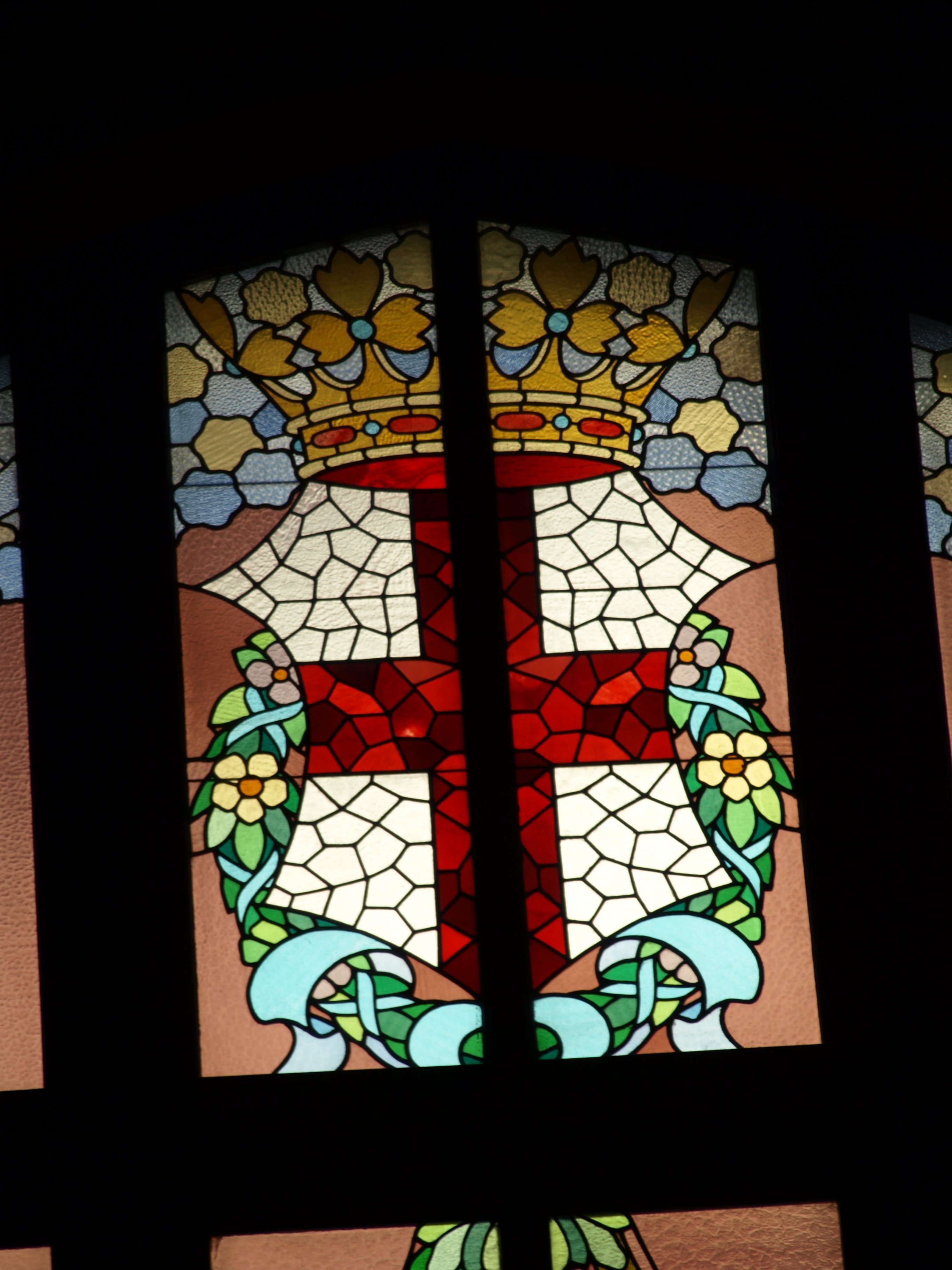
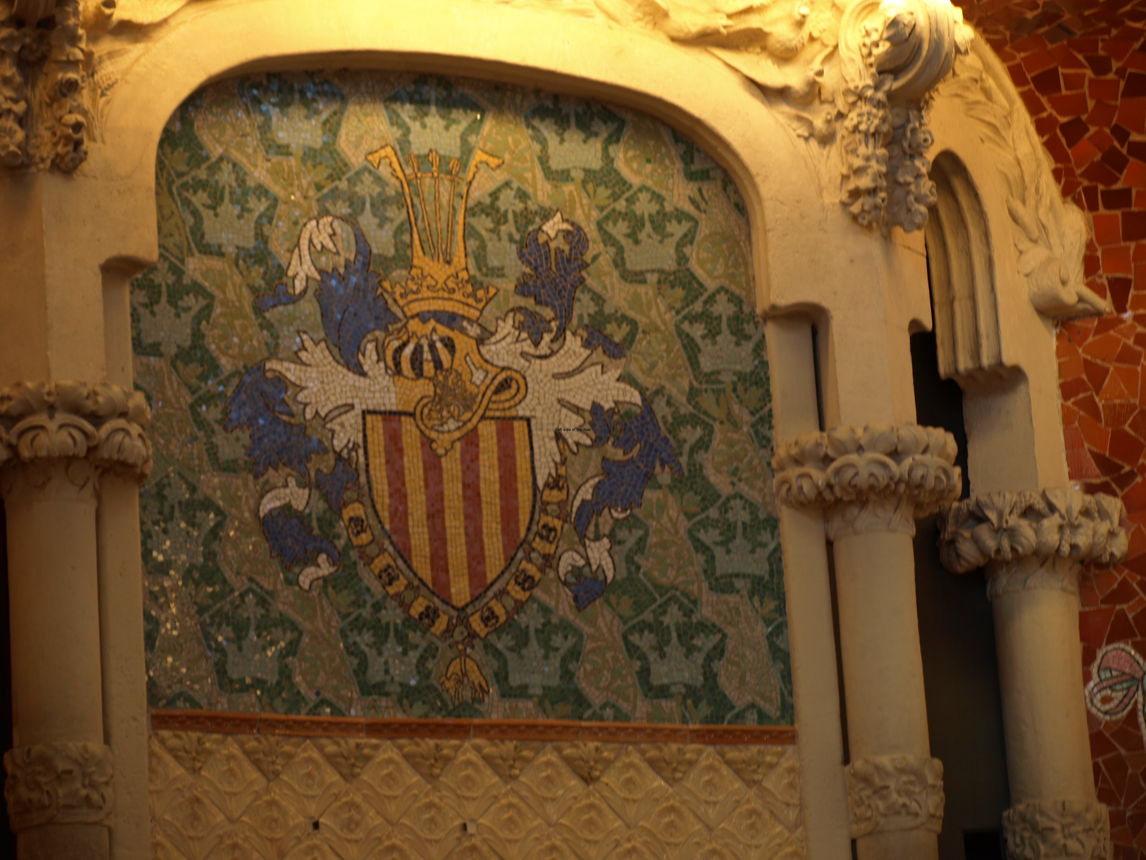
This meant the repeated representation of the Catalan flag, the yellow and red, and the red cross on white, symbolising St Jordi (St George) especially in glass but also in ceramics. The shield of the Catalan lines also appears carved into both wood and stone. But come the victory of the Fascists under Franco in 1939 this all became a no no.

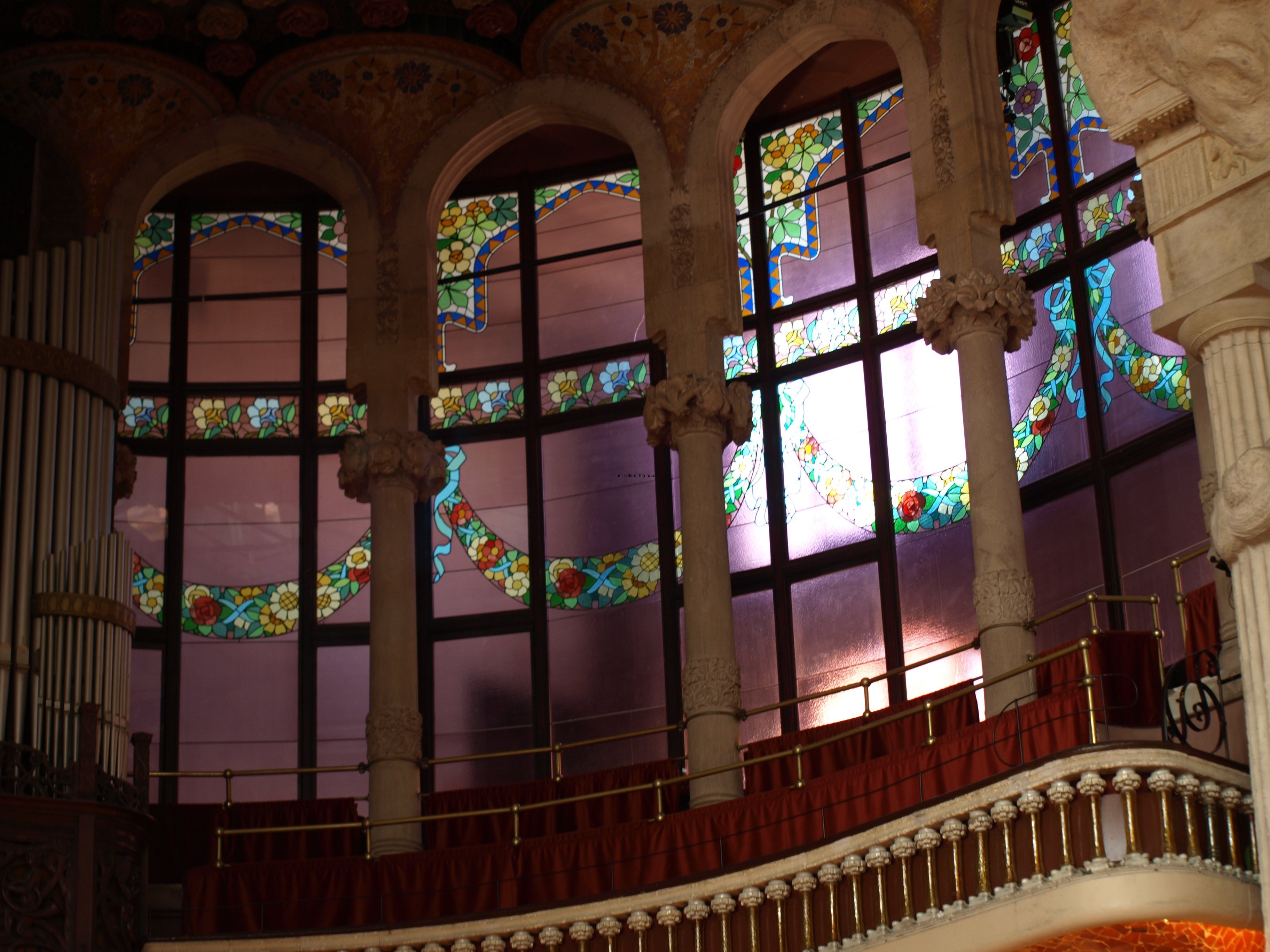
Franco was for a ‘united’ Spain at any cost and imagery that contradicted that ideology was removed from view. That meant that the Catalan flag that appears on the top half of the windows on all three levels of the main concert hall were blanked out. Why they weren’t just destroyed and removed forever I don’t know. Presumably the Fascist in charge had an uncharacteristic sense of culture. This was mentioned as part of the tour some years ago but is not considered to be of relevance now, or so it seems.

This de-politicisation of the past, more significantly the period between 1939 and Franco’s death in 1975, is something which none of the regions of Spain that I’ve had the opportunity to get to know seem prepared to face. Just ignore it and it will go away, seems to be the hope. But that won’t happen when parties like the PP (Partido Popular, a mish-mash of proto-Fascists and head banger Opus Dei Catholics) are around and even in power at a national level at the moment.

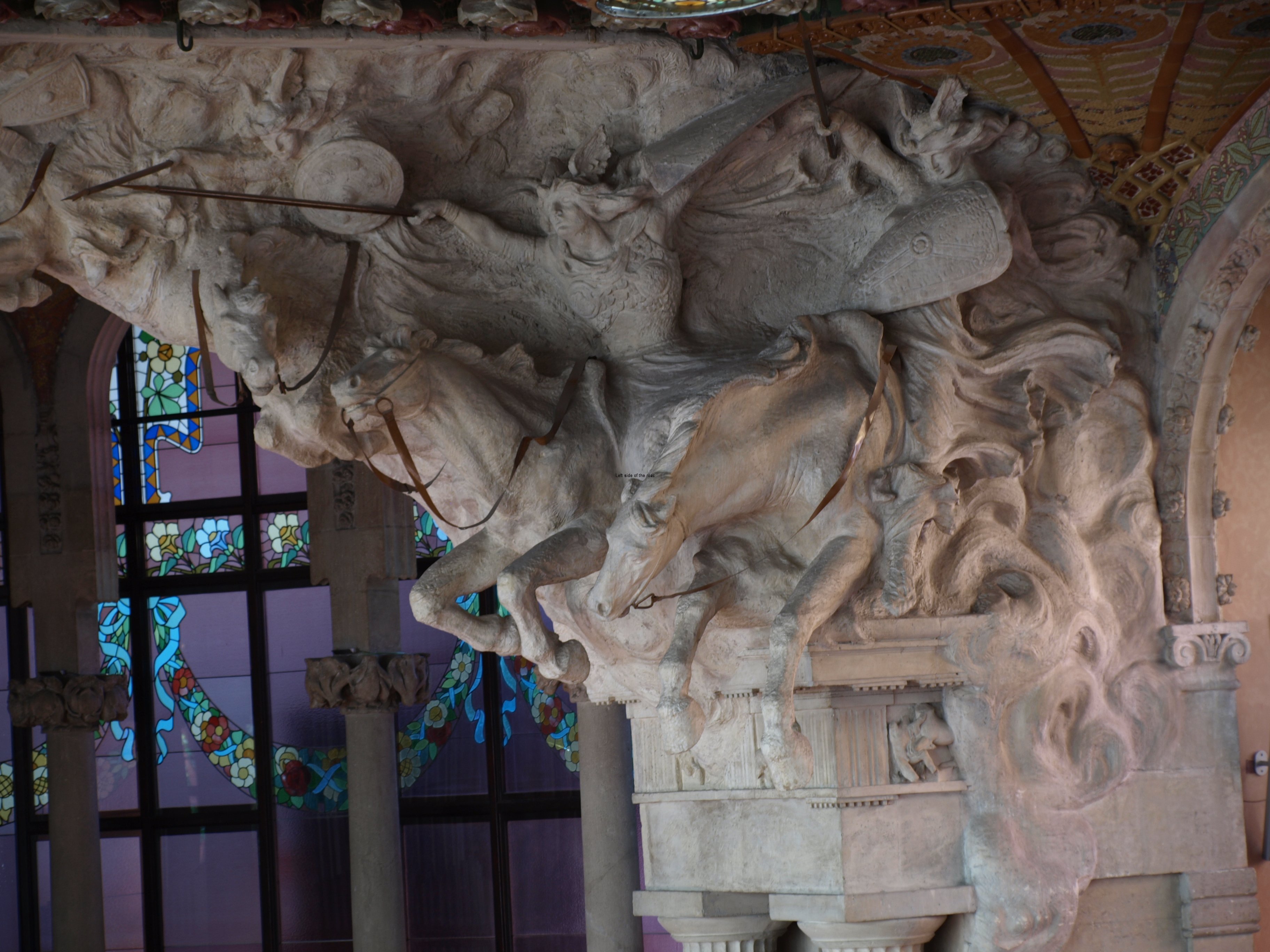
On a completely different tack, and something which I can’t remember occurring to me in the 90s, is how Domènech i Montaner was able to design a structure which uses so much hard material (such as marble, ceramic tiles and glass, as well as a not insignificant amount of wrought iron) was able to produce a concert hall that has been used for solo singers to full-blown orchestras and no one complains about the acoustics.

I’ve never attended a concert in the building (which must be difficult for those who either love or hate the design – one group would be forever looking around in admiration and the other with their eyes closed) but just experiencing the voice of a female guide, talking quite normally in a large space, I had no impression that sound quality was an issue.

This I find difficult to understand. Most concert halls I’ve been to seem to be buried in the deepest heart of the building away from any outside influence but here the main concert hall, on three sides, has the outside world just the other side of the glass windows. (OK they are now ‘double glazed’ but that’s not making much of a difference from the original arrangement.) It even gets lit in the day time by the light provided by the sun.

If I compare this place with the Liverpool Philharmonic Hall, for example, they are so completely different. In the Liverpool Phil there’s nothing harder than the brass instruments (if you ignore the heads of some of the patrons) to interfere with the acoustics – soft wood and highly technological design of the padding is the order of the day there. All missing from the Palau de la Música Orfeó Català, which has been around for considerably longer.

Finally, everything must change, nothing stays the same, but why is it that so much change is for the worse?

Although I’ve been to Barcelona over the last few years (there was a gap in the early 21st century when I wasn’t in Catalonia at all) for different reasons I hadn’t been around the Sant Pere district, where the Palau de la Música is located. So it was with an element of shock that I returned to find that someone, in their infinite wisdom, had decided on a modern extension to the building on its western side, the one facing Via Laietana.

I might have known, but hadn’t remembered if I did, that the building had been given a World Heritage Building status in 1998. I can go with that. It’s unique and seems to deserve that level of recognition as a form of protection – but that hasn’t been the case.

I fail to understand what ‘World Heritage’ status really means.

I’m not, I believe, against modern architecture. In fact just the opposite, it’s just that where I live we seem to get the worst of the results. If ‘planning’, as we’ve got to know it in the 20th century and subsequently (even though the Tory philistines are seeking to claw back what little we’ve gained in the UK), means there are restrictions on what and where developers can build this should be supported by international bodies.

If cities and, in the case of the Palau de la Música, buildings are going to boast about and promote the fact of their World Heritage Status (it’s even on the entrance ticket) then the awarding body has to take some action if, after the designation of such an accolade, the city/building then goes and does something which, for any normal, thinking and concerned individual, seems to go against the principles of the award in the first place.

For example: the building of three totally inappropriate buildings on Mann Island, between the Albert Dock and the Pierhead in Liverpool.

For example: the building of a huge (though almost certainly impressive technologically) road bridge over a valley close to Dresden, Germany, and destroying the classic view of the city, known as the Waldschlösschenbrücke.

For example: the building of a high-tech extension to the Palau de la Música.

When I first saw the building I’m sure I came from the direction of Via Laietana. That’s how most people arrive. When it was planned,and then built, in the first years of the 20th century it was on a limited space, a church being on the west and apartment buildings already on the north, east and south. Some years ago the church was knocked down which opened up a square so that by turning the corner from the main road you would, all of a sudden, be confronted by this wonder/monstrosity – depending upon your attitude.

Now that’s all gone.

The western façade is hidden behind a glass walkway and the part directly joined to the main entrance of the original building has been totally obliterated. So what at one time was an opening up of the view of the building has been lost behind modern concrete, glass and brick.

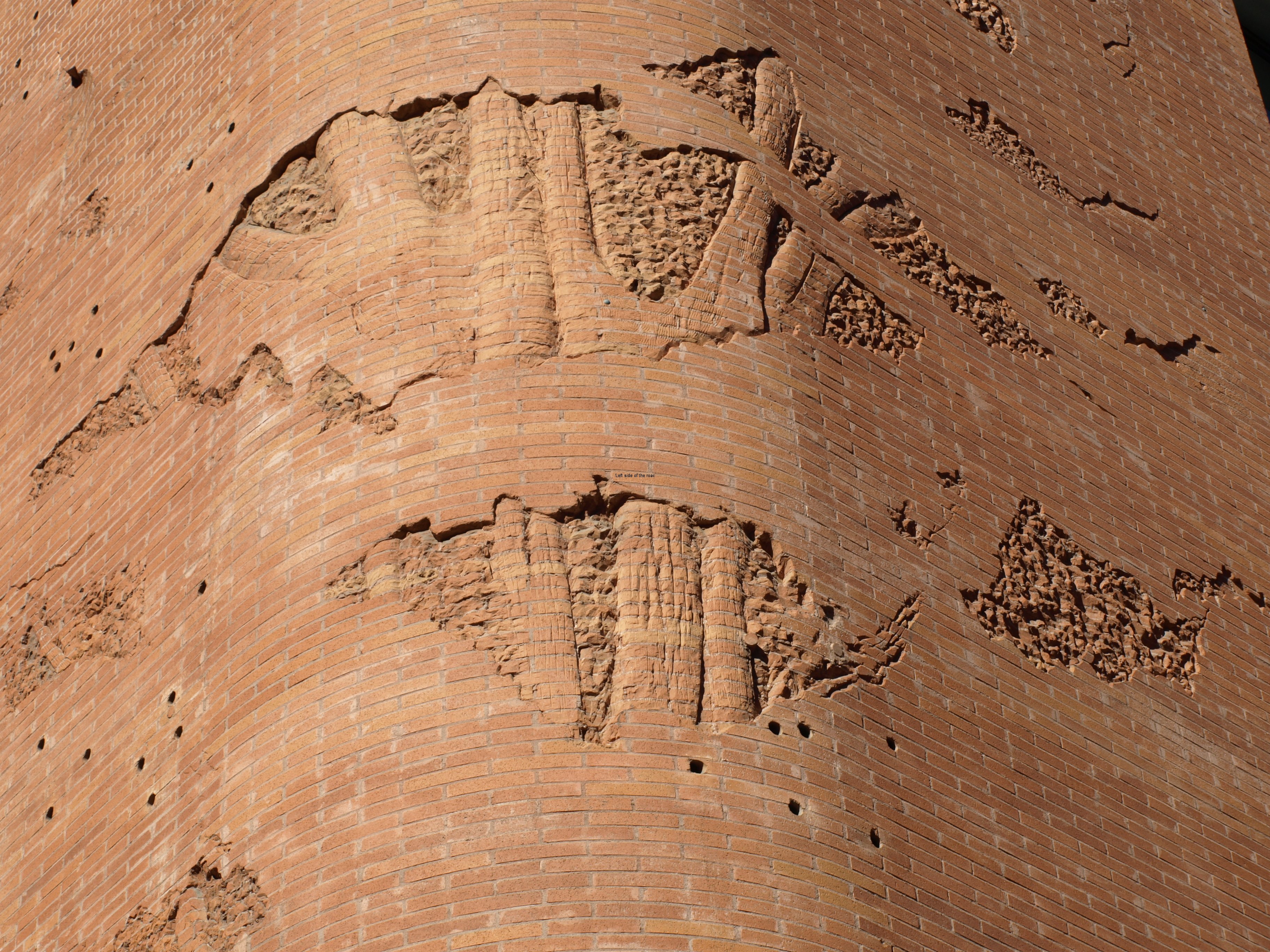
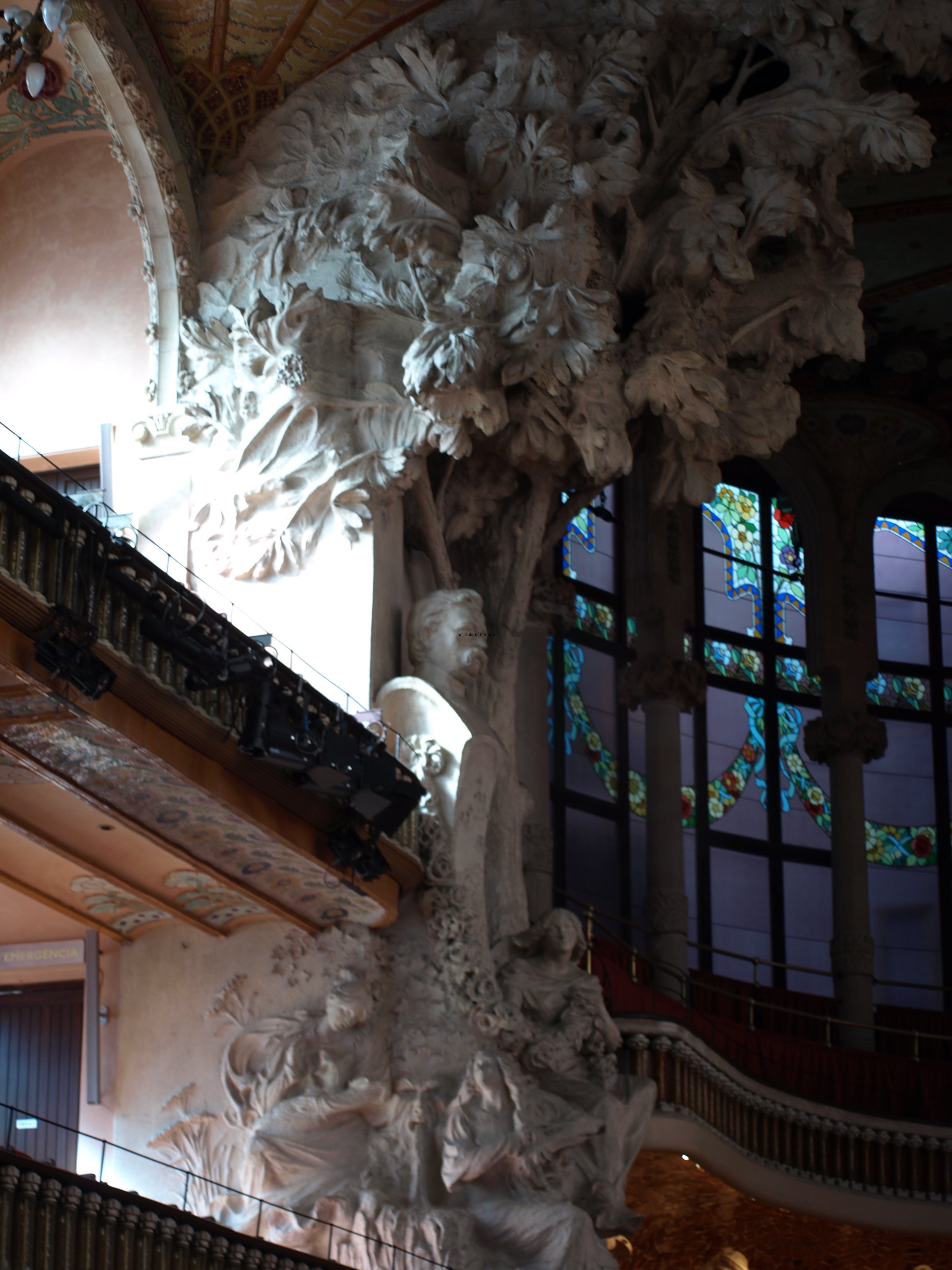
The rounded brick corner that follows the line of the main entrance is a clever piece of brick work and design, but it’s in the wrong place. On the corner there’s a representation of a tree and if it had been anywhere else I would have had nothing but praise for the architect/designer. As it is this structure houses a smaller concert hall – if one was really necessary in the centre of Barcelona did it need to be there? – and, I’m sure, of more importance to the owners/managers of the space, a fancy corporate entertainment space. The day that I was there was the day before the opening of some the Mobile World Congress conference/jamboree/blowout/extravaganza.

Now in all these cases the owners/managers/politicians would have said that this was vital for the economy of the building/enterprise/economy/employment/etc./etc. I’m not from Barcelona but I’m not aware that all this wealth has ‘trickled down’ to those who are facing dire consequences due to the bankers/politicians created ‘crisis’. (How can it be a ‘crisis’ if the rich continue to get richer and the poor get poorer?)

But my final comment/question is: Why does World Heritage continue to go against its stated aims? If the organisation doesn’t care about these places and puts the dollar/pound/euro before any historical or cultural considerations then at least be honest and say so. Don’t maintain the moral high ground and then fall at the first hurdle.

Next we will read that Coca Cola has put a flashing neon/LED sign on top of the Taj Majal and McDonalds are serving their special, unique and nourishing creations to visitors as they behold this monument to love and devotion.

And no one will care a toss.

Practical Information:

Location: From Via Laietana the Palau is at the beginning of the narrow Sant Pere Més Alt. The ticket office is in the new part of the building, at the opposite end to the main entrance, and after the corporate entertainment section – few of you will be invited there.

Getting there: From Metro L4 (the yellow line) on the Via Laietana exit it’s only a few metres from the beginning of Sant Pere Mès Alt,

Entrance:

There are two types of tour, with a physical guide or self guided. For either it is probably best to book online – although you can also book at the ticket office attached to the building.

Guided Tour 

Price: Online €11 + €1 booking fee, children under 10 Free

Self-guided Tour

Price: Online €10 + €1 booking fee, children under 10 Free

The tour is offered in the following languages: Catalan, Spanish, English, French and Russian – check the screen beside the ticket office for the times when your choice of language is being offered. The guided tour is about an hour long, entering and leaving at the same place, the original main entrance in Sant Pere Mès Alt.

More on Catalunya/Catalonia